French Fighter Competition: Early 1930s


I've probably said it before and will probably say it again: Following the aircraft industry was a lot more interesting before 1960 than since. That's because airplanes became much more complicated, which meant that development times and costs increased considerably. In recent times, airliners and combat aircraft take years to bring to production, but they also stay in production and service much longer than in the old days. For example, Boeing's single-aisle 737 series prototype first flew 45 years ago, and variants will be in production for years to come. So far as the aviation buff is concerned, the amount of interesting new stuff had been reduced to a trickle over the years.

Wars and threats of wars served as spurs for technical progress in aviation. Most striking is a comparison of aircraft entering service at the end of 1918 with those flying mid-1914, just before the Great War started.

A consequence of the war was greatly lessened demand for new military aircraft. Technical progress became relative slow so there was less motivation to rush what new designs there were into production. The main French fighter of the early-mid 1920s was the Nieuport-Delage 29, a design under development in the closing months of the war. The late 20s and early 30s saw production of the Nieuport-Delage 62 series that boasted a top speed only 20 miles per hour (30km/h) faster than the NiD-29.

By the late 1920s the threat of a major new war was still small, but the need to modernize was growing stronger thanks to recent technical innovations. The French initiated a specification in 1930 that was modified in 1931 and 1932, forming the basis for a new generation of C1 category aircraft. (C1 is short for Chasse -- fighter (actually, "pursuit," as the U.S. Army Air Corps also called it) -- single-place.)

It's almost hard to believe from today's perspective, but ten different manufacturers submitted entries. That's because aircraft were pretty simple in those days; the builder basically had to come up with an airframe compatible with "government furnished equipment" such as the motor, weapons, radio, and so forth. Even so, airframes were beginning to require more technology than previously, this largely due to the replacement of wood or metal-tube frameworks covered by canvas with (nearly) all-metal construction.

Here are the planes involved in the concours:

Gallery

ANF-Mureaux 170
Although it performed well, this fighter was rejected because the position of the wing interfered with the pilot's forward field of vision.

Bernard 260
The Bernard was unusual in that it had advanced features including slats and trailing-edge flaps on the wings. But it failed to win a production contract.

Gourdou-Leseurre 482
This aircraft suffered from above-average aerodynamic drag, so it fell short of the speed rquirement and was eliminated from contention.

Morane-Saulnier 325
The Morane experienced severe buffeting that was never completely cured.

Wibault-Penhoët 313
Although it offered promising performance, a long development cycle caused the Wibault to lose out.

Blériot-Spad 510
The only biplane in the competition, the Blériot-Spad received a contract for 60 examples. It was the last biplane fighter accepted by the French air arm.

Loire 46
The Loir 46 was an advanced version of models 43 and 45 that, in stages, were in the concours. The 43 and 45 had a wing positioned similar to that of the ANF-Mureaux, but the 46 was an extensive redesign that featured an aile du mouette, or gull-wing. It too saw production. Some 60 were ordered by L'Armée de l'Air while a handful of developmental aircraft were sold to the Republican forces during the Spanish civil war. (These numbers have been disputed, but there is no question that production was less than 100 aircraft.)

Dewoitine 500
This was the winner of the concours and production of variants was in the low-to-mid hundreds.

As noted, the competition dragged on for several years. And then getting the Loire 46 into production took longer than it might have, thanks to the nationalization and consolidation of French airplane builders in 1936; its first-line service life was about two years. By late 1938 this generation of fighters began to be replaced by the Morane-Saulier 406, a monoplane featuring retractable landing gear and an enclosed cockpit, standard features of World War 2 fighter planes.

Hidden Treasures of the Kingdom Part One

Over the weekend a large group of people met at North Shore Assembly of God in Malden to learn about four people doing Kingdom work right under our noses here in the Greater Boston area. Pastor PoSan Ung of Cambodia, a refugee and a survivor of the "killing fields" has founded the Living Fields ministry.


Pastor PoSan Ung and his wife

Did you know the Boston area has the second largest population of Cambodians outside of Cambodia? PoSan is a cheerful, generous person and I can't wait to visit him with friends and be part of his work in Lowell and Lynn. He gave me a very nice t-shirt and an outreach card with the gospel in Khmer language!


Cambodian dancers
See the nice t-shirts?


Thank you, PoSan! Some of the young people from the community did traditional and nontraditional dances, both of which were inspiring. PoSan welcomes servant hearts to come alongside and join in this work among American Cambodians!


Traditional dancers from Cambodian Church


Emily Carr's Centered Compositions


Emily Carr (1871-1945) is one of Canada's most famous artists. And if you visit Victoria, British Columbia, her home town, and wander the old part of the city near the touristy harbor, it's hard to escape references to her. Wikipedia can still be hit-and-miss when it comes to being comprehensive, but its entry on Carr contains a good deal of useful detail about her and her career as a painter and writer.

The largest trove of Carr's painting seems to be in Vancouver, a city I find unappealing apart from its spectacular setting. So the Carr paintings I tend to encounter are in Victoria, whose art museum devotes a room to her work.

Carr received artistic training, plus she was friends with leading artists such as Lawren Harris (who I wrote about here) and Mark Tobey. Which is why it puzzles me that she often resorted to placing subjects of paintings at or near the center of the horizontal axis of her paintings. I suppose this can be explained through an analogy to a portrait painter placing his subject in a similar way. Still, the result is a little too static for my comfort.

Let's take a look at some examples.

Gallery

Painting of a tree; don't have title or date for this

"Red Cedar" - 1933

"Heart of the Forest"

"Crying Totem" - 1938

"Indian Church" - 1929

LA DEUTSCHER WERKBUND, semilla de La Bauhaus


Así como La Bauhaus (este Blog 16 y 23 de Mayo de 2010) es conocida incluso a nivel popular, no sucede lo mismo con la Deutscher Werkbund, que podríamos decir que fue la semilla de la primera.


 DISEÑO EN CRISTAL


Esta primavera tuve la oportunidad de visitar una interesante exposición que me acercó a este movimiento que se puede considerar la base para lo que más tarde sería La Bauhaus. Entre muchos de los que apoyaron y se implicaron en ese proyecto estaría precisamente Walter Gropius, que posteriormente tomaría las riendas de La Bauhaus, siendo uno de los fundadores. 


 GROPIUS FACTORIA


La exposición, aún vigente hasta el 29 de septiembre, se encuentra en el Museo de Artes Decorativas de la ciudad de Madrid bajo el atrayente título de “100 años de Arquitectura y Diseño en Alemania. Deutscher Werkbund 1907-2007”

Desde aquí os animo a disfrutar de la Exposición, y también del magnífico edificio sede del Museo, cuya fachada de ladrillo rojo y piedra, sus escalera de mármol de estilo imperial, y sus paredes ricamente decoradas con mosaicos y pinturas italianas, proporcionan al visitante la oportunidad de visitar un museo que es una más de esas sorpresas que nos ofrece la capital madrileña. Os añado la web de este Museo.


Dejaré para vuestro descubrimiento la colección propia del museo compuesta por documentos, objetos y diferentes piezas, tanto de España como de otros países europeos y de Extremo Oriente, y me centraré en el tema de la Entrada de hoy. La exposición temporal sobre La Deutscher Werkbund.


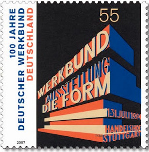
 SELLO CONMEMORATIVO


Era ésta una asociación mixta compuesta por arquitectos, artistas, pedagogos, diseñadores y otros profesionales y artistas que tenía como objetivo lograr la mayor calidad posible en los diseños industriales, diseños que habían ido perdiendo calidad artística con el avance de la industrialización. Ese buen hacer en el diseño y esa búsqueda de la calidad en productos, llamémosles industriales, sería algo fundamental para la cultura del Diseño que todos conocemos en la actualidad.


 ARQUITECTURA WERKBUND EN PRAGA


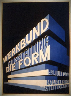
Fundada en Munich en 1907, por Hermann Muthesius, se extendería a otras ciudades y dejaría su huella en la arquitectura, el diseño y la industria de todo un siglo. De ahí el interés de esta exposición ya que nos muestra la filosofía del proyecto en un recorrido por toda la historia del movimiento que abarca desde las colonias de edificios representados en las maquetas que se exponen, pasando por el interior de esos edificios, con su mobiliario práctico y vanguardista, y todo lo que surge del diseño industrial en ese siglo. Por supuesto, el diseño gráfico está muy presente y encontramos una amplia muestra de carteles anunciadores de las diferentes muestras y exposiciones. 


 DISEÑO INTERIOR WERKBUND


Si el objetivo de La Deutscher Werkbund era lograr el despunte de la industria alemana en competición con la de otras potencias como la americana o la de Gran Bretaña, lo logró ampliamente, pero en mi opinión, tan importante como ese logro es la base o filosofía del movimiento, aquella que perseguía que el trabajo profesional tuviera la misma categoría que el artístico y artesanal. Que fuera un todo. Y para conseguirlo toda la sociedad debía de estar implicada. Todos los ámbitos sociales como aquellos dedicados a la educación, a la formación, los medios de comunicación etc. Otra de las pruebas del éxito de este movimiento se vería posteriormente en lo que fue La Bauhaus, nacida del embrión de La Deutsher Werkbund.


  JUEGO DE CAFÉ DE DISEÑO CLÁSICO


Hay que inclinarse ante el trabajo de todos ellos, ante la creatividad y tesón para lograr éxito en todas las disciplinas, como por ejemplo conseguir que en la arquitectura se lograra una auténtica revolución, tanto en los edificios como a la hora de urbanizar, sentando las bases de lo que sería el racionalismo. 


  WERKBUND ARQUITECTURA


Como podéis suponer un siglo de este movimiento abarca no sólo avances y cambios, también muchos enfrentamientos y contradicciones entre los muchos componentes e impulsores de la filosofía en que se basaba la Deutscher Werkbund. Esta Entrada no tiene por objetivo relataros toda la historia del movimiento, sino hacer un pequeño resumen y ser un pequeño “aviso” para que nos detengamos en los puntos más interesantes de un proyecto que fue revolucionario y sentó la base no sólo para La Bauhaus sino también para el mundo industrial actual.


TETERAS Y CAFETERAS EN METAL


No obstante, es importante hacer hincapié en esas confrontaciones, contradicciones y polémicas ya que son éstas precisamente las que dan la oportunidad de debatir e intercambiar diferentes puntos de vista y llevan a personas creativas a hacer historia. También considero de sumo interés que este movimiento abarcase todo un siglo con dos guerras mundiales de por medio ya que los grandes conflictos obligan a pausas o parones en la productividad pero a la vez son revulsivos para la creatividad.


  CARTEL ANUNCIADOR DE UNA EXPOSICIÓN


Como he mencionado, otras ciudades estuvieron implicadas en el mismo movimiento. Muy importante fue la ciudad de Colonia. Fue en esta ciudad dónde se construyó el teatro que albergaría la exhibición del Deutscher Werkbund en 1914. El arquitecto que lo llevó a cabo fue el belga Henry van de Velde y al parecer fue uno de sus mejores trabajos que además coincidió con el momento de más auge del movimiento antes de la primera guerra mundial. Desgraciadamente el edificio fue destruido apenas un año después a causa de la guerra.


 CARTEL DE LA EXPOSICIÓN DE 1914 


El interés por dar a conocer todo aquello relacionado con la Werkbund fue muy intenso y se logró a base de publicaciones, carteles, logotipos etc. Y es que la Werkbund abarcaba todo lo relacionado con el diseño industrial desde lámparas, mobiliario, juegos de té y café, pasando por locomotoras, aviones y por supuesto la industria gráfica como se ve en sus carteles y publicaciones. Los anuarios editados son una buena prueba del alcance que se logró en el arte gráfico.


 DIBUJO DE UNA DE LAS PUBLCACIONES


En su extensión europea pronto pasó a Suiza donde se le conoció con el nombre de Swiss Werkbund que tuvo la sede en Lausanne.


 LA TORRE DE CRISTAL


Si en arquitectura el movimiento representó una defensa de una construcción en la que estaría el hormigón o el vidrio y un hacer práctico, en la producción industrial, se logró que los objetos fueran, además de prácticos, más simples y menos superfluos sin perder por ello calidad, consiguiendo con esa sencillez y buen hacer la belleza que logra el Arte. Al final tenemos que rendirnos al “Menos es más” de Mies van der Rohe.


JUEGO DE CAFÉ DE DISEÑO VANGUARDISTA

La Deutsher Werkbund representa un siglo de enseñanza y aprendizaje, que enlazó con el proyecto de La Bauhaus y sentó las bases del diseño pero también el camino del cambio de lo que hasta ese momento se había considerado Arte e Industria, Arte y Artesanía


NOTAS: Para mejor visualizar la fotografía “picar” con el ratón encima de las que interesen.
Para la lectura de entradas anteriores, ir a la ventana de la derecha y “picar” en los años y meses. Se desplegarán los títulos correspondientes a cada fecha.
Para la elección de otro IDIOMA ir con el cursor al final de la página.


Fuentes consultadas: La Bauhaus . Ed. Jeannine Fiedler y Peter Feirabend
Historia del Arte del siglo XX. Ed. Taschen
Arquitectura del siglo XX. Ed. Electa
Para la fotografía: Las mismas, la red y Catálogo Museo Artes Decorativas.

Molti Ritratti: Edith Minturn Phelps-Stokes


Edith Minturn Stokes (1867–1937) and her husband Isaac Newton (I.N.) Phelps Stokes are the subject of a famous painting by John Singer Sargent, now residing in New York's Metropolitan Museum of Art.

I couldn't find much biographical information about Edith. Wikipedia has this entry on Isaac, but more about Edith can be found here.

However, the images below do indicate that Edith was a very attractive woman.

Gallery

The Minturn sisters
Edith is at the right of the photograph.

By Carl and Fredrika Weidner - c.1895
The original is a miniature. Edith is at the left.

By Daniel Chester French - Statue of the Republic
Edith posed for French's giant statue for the 1893 Chicago fair. A smaller version was made in 1918, and that is the one shown above. More information about the statues is here.

By Fernand Paillet - 1892
This must have been painted about the time French was working on the statue.

By Cecilia Beaux - 1898
Beaux was an ace portrait painter who had the thankless task of painting Edith a year after Sargent created his masterpiece version of. Beaux was very good, but comparing the two versions of Edith, it's hard to dispute that Sargent was even better. Well, flashier, anyway.

Feature-Distorting Makeup Fashions


If you don't have a model handy, the next option is using a photographic reference. And if you want to paint a picture of a pretty woman, why not use a photo of a movie star.

I'll tell you why not.

One reason is that publicity photos are usually retouched, and that retouching can distort light-shade relationships, hiding the true facial structure to some degree. This was particularly evident before 1950, when most publicity shots were in black and white which made extensive retouching easier to perform. (It's interesting that Joan Crawford had a heavily freckled complexion, yet nearly all publicity photos hide it.)

Another reason has to do with fashions in make-up. From the mid-1920s to around the mid-1940s, lipstick and eyebrow makeup practices were tailored to distorting natural facial features. Such distortions make it somewhat difficult to understand exactly what the underlying face was like.

Combining these two problems results in photos that are not worth using for reference unless one's goal is painting a period-piece scene. The photos below illustrate my point.

Gallery

Clara Bow - late 1920s
Evelyn Brent - late 1920s
Not all women did this, but some important movie stars did: Note the "bee sting" lipstick pattern where the edges of the mouth are not painted while areas above and below the lips at the center of the mouth are. The Cupid's bow feature of the upper lip is slightly exaggerated by the lipstick application shown in these photos.

Constance Bennett - 1933
Jean Harlow - mid-1930s
During the early to mid 1930s the Cupid's bow continued to be exaggerated, as can be seen in the photo of Constance Bennett. At least coverage now extends to the corners of the mouth. The Jean Harlow photo shows another fad of that era: natural eyebrows plucked and replaced by a penciled-in line. I have no idea why people thought that stunt improved beauty.

Ann Sothern - late 1930s
Hedy Lamarr - early 1940s
Veronica Lake - early 1940s
Natural eyebrows returned by the late 1930s and even received eyebrow pencil enhancement. Lips were enhanced by lipstick extending very slightly beyond the edges of the lips themselves.

I find that there are still a fair number of 1925-45 photos acceptable for reference. After 1945, matters improve somewhat. But an artist's best bet is to rely on informal photographs where retouching is absent and makeup is more likely to be lightly applied.

The Mural as Artistic Immortality


Murals still get painted, but seldom do I learn of a new one that is a Truly Big Deal.

A century ago, that wasn't the case. Murals were a major player in the history of Western art, and a few remain world-famous. (I'm thinking the "The Last Supper" by da Vinci and Michelangelo's Sistine Chapel work, even though the latter was painted on a ceiling rather than a wall.) In fact, murals were so prestigious that at least two important artists twisted their careers to become mural painters in an attempt to "play Shakespeare." One did so as a sideline to a varied career and another is better known for his murals than for his easel paintings. For this post, I'll deal with them along with two other Americans involved in that trade.

Let's see what they produced.

Gallery

From the Holy Grail series by Edwin Austin Abbey
Abbey had a varied career ranging from illustration to fine arts painting to a good deal of mural work. The image above is of one of his murals (or really, really large paintings) in Boston's Public Library.

"City Activities with Dance Hall" by Thomas Hart Benton - 1930-31
Although some writers lump Benton into an "American Regionalist" category, a good deal of his work does not feature Midwestern scenes. The example above is from a set of murals he painted for a new building housing New York City's New School for Social Research (as it was known at the time).

Mural study for Los Angeles Public Library Building
Mural for Los Angeles Public Library Building by Dean Cornwell
Cornwell was one of the most successful illustrators of the 1920s. Apparently this did not satisfy him, so he decided to take up mural painting in an effort to (I suppose) become more artistically respectable. He went to England to learn some of the muralist's trade under Frank Brangwyn. The Los Angeles library project seen above was his greatest effort, though his expenses and the time it took for completion did not make it profitable; he continued to rely on commercial art to subsidize his mural painting. Despite that, he took on other mural projects, as the link indicates.

Rotunda murals, Boston Public Library
Boston Public Library rotunda"Heaven" in Boston Public Library, by John Singer Sargent
Sargent was an extremely successful portrait painter who felt that such work was somehow not worthy enough. So he managed to get in on mural projects for the new (1895) Boston Public Library building on Copley Square. Two decades later, he was still working on those murals.

Seen from today's perspective, mural painting seems a more risky route to artistic immortality than easel painting. That's because paintings on canvas, board or a similar support are portable. They can be stored comparatively easily and snatched from harm's way. The fate of a mural is usually tied to that of the building that houses it.

Henry Tonks: Physician-Painter-Teacher


Henry Tonks (1862-1937) studied and practiced medicine before switching to art when in his early thirties. This is sketched in his Wikipedia entry, but better biographical information can be found here.

Thanks to his anatomical expertise, London's Slade School of Art hired him to teach drawing. According to the link above, Tonks was a formidable teacher who, consciously or otherwise, intimidated many of his students. On the other hand, he was at Slade when it turned out many of its most famous graduates. Those who were instructed by Tonks included Augustus John, Gwen John, Percy Wyndham Lewis, C.R.W. Nevinson, Mark Gertler, Stanley Spencer, John Currie, Dora Carrington, Maxwell Gordon Lightfoot, Dorothy Brett and Paul Nash. Even though many of these became modernists of one stripe or another, Tonks himself had no use for Cubism or any of the other movements.

As can be seen in the selection below, Tonks seemed to prefer social scenes featuring young women. However he became a war artist in the Great War and did medical-related art in the form of a series of studies of soldiers who sustained severe facial wounds.

Gallery

The Hat Shop - 1892

The Matinee Rehearsal - c.1900

The Torn Gown

Study of a woman

The Birdcage - 1907

An Advanced Dressing Station - 1918

Spring Days - 1928

As for Tonks' paintings, my take from images found on the Internet is that he was certainly competent, yet lacked whatever kind of spark it takes to make his work truly distinctive and compelling.