Alphonse de Neuville: War Art Master


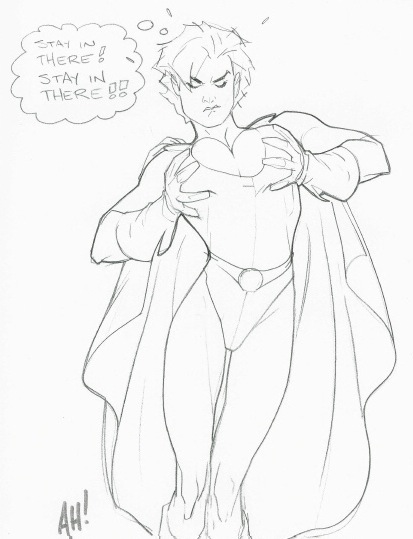
When I wrote about combat art a while ago I mentioned that I thought that the best of the examples shown was a painting by Alphonse de Neuville (1835-1885). Actually, as I sit typing this post, I can't think of an artist who did that kind of job better. But if I do come across a better combat artist, I'll let you know.

Here are examples of his work dealing with the Franco-Prussian War:

Gallery

Les dernières Cartouches - 1873
This is Neuville's most famous painting, depicting surrounded French troops fighting at the point where their last cartridges are about to be expended.

Attaque, par le feu, d'une maison barricadée et crénelée - 1875
Aside from some corpses, not many men are to be seen in this urban skirmish.

Défense de la porte de Longboyau - 1879
Neuville liked to paint lots of men at dramatic moments. And he seldom failed to include wounded and dead soldiers.

Bivouac devant le Bourget, après le combat du 21 Décembre 1870 - 1872
A moment of calm following a battle near where Charles Lindbergh landed the Spirit of St. Louis 57 years later.

Le cimetière de Saint-Privat (18 Août 1870) - c.1881
Once again German troops are about to breech a French defense in the war that cost Napoleon III his throne.

Scène de combat dans une église - c.1881
Neuville loved to include a lot of atmosphere; note the smoke from gunpowder.

Un porteur de dépêches: Sainte-Maries-Aux-Chênes, près de Metz (Septembre 1870) - c.1881
A comparatively calm scene where a French courier disguised as a peasant is brought before Prussian officers. Because he is not in uniform, he likely will be executed.

A Cavalryman - 1884
Neuville also painted studies of various soldiers.

Neuville's Wikipedia entry is here. And there is a recently published book about him.


I see that Amazon lists it, but I bought my copy through their French site (amazon.fr). It has plenty of reproductions including some full-page detail views. The text is in French and mostly comprised of quotes from reviews of his works along with some of his family correspondence. I considered the pictures more than enough to justify the price.

As for seeing his works in person, the Metropolitan in New York has one, but I suspect it isn't on display (let me know if I guessed wrong). You can see some of his work in Paris at the Musée de l'Armée, but otherwise you'll probably have to rent a car to track down his most important paintings elsewhere in France.

Visiting Author- Julie Rennie


Julie Rennie
Friday 4 November 2011
6pm for a 6:30pm start
Narellan Library
$6 per ticket
includes refreshments
bookings essential


Julie Rennie will visit Narellan Library to discuss and promote her new book The
Metabolic Clock. The Metabolic Clock is based on research that verifies that the body has natural cycles that manage appetite, energy, mood and sleep. This book provides an easy to follow weight loss plan that increases your energy, provides positive motivation techniques.


Julie, who has appeared on The Today Show and more than 30 national magazines and newspapers, is an inspirational mentor and speaker encouraging thousands of people to transform themselves and live with optimal wellness.


For more information , please contact
Narellan Library on (02) 4645 5039 or
Camden Library on (02) 4654 7951
For bookings visit:
http://www.trybooking.com/YQR
or visit the library website
The views expressed by this author and the information in their book
does not reflect the views of Camden Council
.

Art Encounters @ Camden Library


ART encounters

ART WORKSHOPS


All workshops are $15 to be held at Camden Library 9am-12 noon.


Bookings are online - Click here to book.

Abstraction Through Still Life And Nature (12 nov)
Using inanimate objects and and specimens from nature as a reference point, become inspired as you create an abstract work of art. Observe and replicate line, form and shape, but with your own artistic interpretation.

Pencil Sketching (5 Nov)
Get back to the basics and be inspired by the endless possibilities of putting pencil to paper. In this workshop you will learn about rendering and shading techniques in both colour and monocromatic scales. Bring along a picture or photograph as a point of reference.

Monoprinting And Relief Printing (19 Nov)
Create unique pieces of art as you learn about this easy and imediate printmaking technique. Learn about line and shape as line drawings become transformed into colourful and vibrant prints.


Art Buzz (Bangalore) Impressions

Turner Prize Finalists 2011


It's Turner Prize time in Britain. This year's winner hasn't been announced yet, but the four finalist are known.

As the link above notes, the prize is given for recently completed works usually in the postmodern Concept Art genre. Examples of finalists' work are shown below.

Gallery

What to Ask for Others - Karla Black - 2011

A Library of Leaves - Martin Boyce

Man - Hilary Lloyd - 2010

The Resurface - George Shaw - 2011

I'm not sure why Shaw's painting made the grade. That's because (1) it's an actual painting and (2) there isn't much concept to it. I suppose the concept part is that he focuses on drab, commonplace subject-matter that a viewer is supposed (I assume) to read meaning into.

Black seems to be following the Marcel Duchamp path of designating whatever the self-proclaimed artists designates as art. Lloyd's piece is projected images, possibly video, though I can't rule out the positioning of the projectors as part of the Installation. Boyce's work can be considered some kind of sculpture.

The works of the latter three are the usual grist that can be found in the Tate Modern. I don't consider most of it art.

My problem is that the term "art" has been watered down (Duchamp's legacy) to the point where anything can be called "art." But if anything runs the risk of being "art," then art is nothing special and the term becomes meaningless.

Something created by a human being that pleases the eye might be considered art; this removes art a step from the proclaimed "art" by the self-proclaimed "artist" noted above. I'm willing to accept this as small-"a" art which this blog deals with it a fair amount.

Then there's capital-"A" Art which I define for the purpose of this post as the traditional Fine Arts.

Turner Prize art mostly falls in the first and (to some extent) second categories just mentioned. Sad to say for the Turnerites, such art has little likely long-term future in the sense that viewers a century from now probably will be less able to grasp the Concepts than the average viewer-in-the-street can today.

I find the Turner Prize both sad and silly. Its main worth is that it demonstrates how far Establishment art has fallen as modernism continues its aimless course.

Free Conference Call


Fabric Art by Marge Malwitz


The Conference call on Oct. 27, 2011 was well attended, thank you for all who participated! 


It was our second Art in Mission call.  Bert VanderMark www.visualparablesart.com and Marge Malwitz www.margemalwitz.com  shared their experiences using art in mission. Discussion focused on how it was done and ways to expand its use.


Narellan Rhythms Festival 2011

Click to enlarge! Hope to see you all there this weekend!

Bernie Fuchs in Telluride


I am kicking myself. Really hard. You see, I was in Telluride, Colorado, the old mining town - cum - deluxe ski resort in September and had totally forgotten that illustration master Bernie Fuchs painted views of the area and was the subject of a major exhibit in a gallery there a year or so before he died. I have a copy of the catalog and had I remembered to do so, I could have brought it along and correlated his Telluride scenes with what I was observing. This would have been interesting because artists necessarily have to be at least a little selective in what details they paint and also can invoke artistic license if deemed necessary.

For readers not familiar with Fuchs, here is his Washington Post obituary, here is a post by David Apatoff, a blogger who knew Fuchs personally and here is the Web site of the Telluride Gallery which held the exhibit and sells his works.

Since I didn't duplicate Fuchs' points of view, the best I can do here is pair two of his paintings with two of my photos that deal with the same subjects, but from different viewpoints. Also, he painted in winter whereas my photo showing mountains includes a dusting from an early storm that passed through two days earlier.

Telluride Looking East - 2007

Looking down East Colorado Avenue

Fuchs placed himself a block or two farther east than from where I shot my photo. His painting has a telephoto lens perspective, so it's quite possible that he worked up the painting from a reference photograph.

Winter Noon on Main Street - 2008

New Sheridan Hotel

My shot of the old (but recently restored) New Sheridan was taken from directly across the street whereas Fuchs seems to have selected the lane in the middle of Easy Colorado that is used as a zone for temporary parking for unloading while checking into the hotel.

MURALISMO LATINO EN SAN FRANCISCO

Alfredo Palacios (el madrileño) nos cuenta sus pareceres sobre el muralismo latino en San Francisco, EEUU, en un interesante artículo de su blog (LINK). Y en una de las fotos pude observar que el mural realizado por nuestro queridísimo amigo salvadoreño Isaías Mata, goza de buena salud. M.C.

Fragmento del mural " 500 años de Resistencia" 30 X 8 mts. Iglesia San pedro, San Francisco California, 1992. De Isaías Mata.

Adam Hughes Draws Cover Babes


The best comic book art is usually found on the covers. That's because an artist can spend more time on a cover illustration than on any one of all the panels required for inside illustration. Oh, and the publisher always wants a flash cover that will generate sales, so that adds to the motivation.

An illustrator whose career has focused on cover art is Adam Hughes (born 1967). His Wikipedia entry is here, his web site here and he also has posted work and comments here.

The image above is the cover of his book dealing with cover work done for DC over the last 20 years along with other items. It seems to be doing well because the copy I recently bought is from the fourth printing.

Allow me to confess that I don't follow the comic book trade nor that of the graphic novels field. It's all so complicated these days what with editors and writers valiantly trying to keep their products fresh by reinventing backstories, creating alternative universes, assembling new character juxtapositions and diving headlong into politically correct themes. When I was a kid reading comic books, the superheroes simply went about their business of dealing with criminals of various sorts.

Another change from the good old days -- one that I approve of -- is the improved quality of cover art. Nowadays there is a body of illustrators who create dramatic scenes whose impact is heightened by the sound drawing and anatomical knowledge of the artist. Such illustrations and their creators are so prized that collections of their work are published in book form, as is the case for Hughes.

But Adam Hughes differs from the rest of that pack: he includes humor and a general light touch as opposed to depicting stern scenes of superheros in conflict with their opposition. Examples are shown below.

I wish I knew more about Hughes' background. He was born and raised in New Jersey but spent most of his career in Atlanta. He has called himself a high school dropout and on another occasion claimed that he didn't go to college because he was, as he has put it, too middle class to get financial aid and didn't muster the grades and test scores to earn a scholarship. As for art, he is essentially self-taught, which is probably a good thing; the usual art school training would have wasted a lot of his time.

That said, Hughes comes off as a sharp cookie in the commentaries he likes to make on many of his works. He knows art history and color theory plus a good deal of general history and other useful knowledge. I didn't catch any serious errors while reading through those commentaries. And by the way, those commentaries are salted with humorous bits; buy the book and enjoy!
Gallery

Catwoman head rendering stages
This shows stages of Catwoman's head as it appears on the book cover. The image to the left is in ink and colored markers. It was scanned into Photoshop where coloring, shading and other details were added; this is Hughes' typical approach, though his convention demonstrations go no further than the ink and marker stage.

Cover art for Catwoman No. 56
This isn't Catwoman, but instead her apprentice Holly who's recuperating at a diner after a rough night learning the cat burglar trade.

Power Girl
The Power Girl character is mega-stacked, and Hughes had some fun with it here.

Bookplate for Hughes' San Diego Comic-Con materials
Hughes is a big Art Nouveau fan and likes to use that style when he can get away with it. That's Wonder Woman, by the way.

Wonder Woman and Lois Lane dish while Superman ponders
Besides Catwoman, Hughes did a lot of Wonder Woman covers. He likes this illustration a lot because Wonder Woman is relaxed and smiling, which he feels is her true character.

Un saludo a Don Amadeo Dell'acqua

En uno de mis viajes para organizar el encuentro de arte pùblico y educación en la ciudad de Mendoza, Mariana y Rodrigo me llevaron a ver unos bellísimos frescos, bastante deteriorados por la húmedad, realizados en el Correo Argentino de Mendoza a principio de los años '50 por el artista Amadeo Dell'acqua. Indagando con mis amigos mendocinos, poco supimos de la vida y obra de  este artista en Mendoza.
Me puse a "ciber" investigar y encontré a un caricaturista experto (dicho por Ricardo Halac en 1972), notable ilustrador  de libros de: Enrique de Gandía (1936),Eugenio Navas (1942),José Martinez Jerez (1934) y Galván Moreno (1931), además de ser escenógrafo, grabador y pintor egresado de la Academia Nacional de Bellas Artes en 1926. Nació en 1905 y murió en el '87 en la ciudad de Buenos Aires.
Don Amadeo pintó además en 1945 un mural de 2m X 6m en óleo sobre madera terciada en el Correo Central de Buenos Aires. Y aquí encuentro la relación con Mendoza. En una excelente investigación de Constanza Eliggi sobre la arquitectura del Correo Argentino de Berisso, di con el dato exacto.
Les dejo fotos del mural de Don Amadeo Dell'acqua en Mendoza y el link de la investigación de Constanza Eliggi, muy buena y contundente sobre la arquitectura estatal del primer y segundo gobierno justicialista (1946-1955).
Don Roberto Utrero nos comenta: 
"El Edificio del Correo de Mendoza se realiza a comienzos de la década de los cincuenta. Es parte de un conjunto de grandes obras que comienzan con el Hospital Central, la Casa de Gobierno y el Palacio de Justicia. 
En el mismo período se construye la Escuela Hogar Eva Perón en el Parque General San Martín. Todas obedecen a un criterio arquitectónico propio de esa época de esplendor que no ha sido superada y que tiene que ver con la irrupción del Estado de Bienestar.
De ahí la importancia pictórica y didáctica del Mural del Correo, en la que se evoca a Mendoza desde sus orígenes". 


Salute. M.C.


Small Cars get Sexier


Small cars sold in America are generally cheap to buy. They also usually look cheap. That's because labor costs for building a small car aren't much less that the cost of assembling a larger car. So what suffers is appearance.

Small cars use less material than larger cars, but not grossly less. What they don't usually have are parts made from top-quality materials. That is, instrument panel knobs and switches are made of cheap plastic, seats are simple and covered with comparatively inexpensive cloth, wheels feature small hubcaps or phoney-metallic disks made of plastic and so forth. Body shapes tend to be simple as well. Rather than fluid lines and dips and creases requiring multiple metal press strikes, sheet metal is usually shaped using as few strikes as possible to cut fabrication costs.

A major exception to all this was the original Volkswagen Beetle that hit American shores in the 1950s. VWs, while not luxurious, were clearly well made and were a sales success.

In the last few years run-of-the-mill small cars are being challenged by new models featuring styling that's as flashy as that used on much more expensive models. Hyundai and Ford are leading the charge; if their sales are good, other makers will have to follow suit.

Gallery

Chevrolet Cobalt - 2007
The Cobalt features some metal sculpting along the sides, but other body panels are generally simple. It looks cheap to me.

Kia Rio - 2009
The same goes for the Rio, a truly basic car.

Ford Focus - 2011
This is Ford's latest iteration of its popular Focus model. It's a European car with modifications required by American regulations and consumer tastes. Note the fancy sheet medal work; it's a lot classier looking than the Cobalt and Rio shown above.

Hyundai Elantra - 2011
The Elantra is also heavily sculpted, providing an image that doesn't seem cheap.