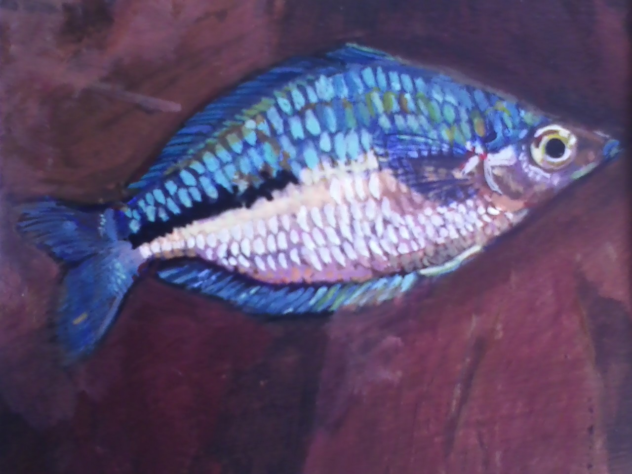
In Lake Kutubu, Papua New Guinea you will find the Rainbowfish, Melanotaenia lacustris. If you want to purchase one, know that it is hard to find with this much coloration. If you are patient and diligent in caring for it, within 12 months you may see males as brilliant as this one. It is an active swimmer, needs lots of open space for darting about, as well as thick vegetation in which to hide. Provide the right environment and the fish will reward you. We live out of the environment of our hearts. Is your heart right? Do you want to live freely able to display your true colors? Above all else, guard your heart, for it is the wellspring of life.
My impression is that the practice of fashion conformity unraveled around 40 years ago. While it's possible to identify characteristics that peaked in usage at various times (bold patterns on men's sport jackets in the early 1970s, padded shoulders on women's garments about ten years later), these styles weren't nearly as dominant as those of previous decades. A good example is women's skirt lengths -- short in the mid-1920s, long in the mid-30s, knee-length in the early 40s, mid-calf during the 50s, etc.
Of course fashion following was never entirely lockstep. Older women tend to shy from wearing short skirts, for instance. And I tend to maintain a preppy look when my wife insists that I have to abandon my beloved blue jeans for some occasion or another.
Then there is the matter of transitions between dominant styles. Women's bobbed hairstyles of the 1920s were anticipated around 1910 when some avant-garde gals got their long tresses chopped. That bobbed style apparently became boring to some women even before 1930 and they began to let their hair grow out. Consider the photo below.
This publicity photo (which I cropped a bit) is of a 1929 Auburn model 120 with girls from a physical culture club of some sort providing a lot of added interest.
Note the girl on the left and compare her hairdo to those of the others. The girls on the right have the typical tight-wave permanents of the 20s, the one on the left has much longer hair that strikes me as being more "natural" and perhaps "timeless." She also lacks the boyish, curveless figure that was the height of female body fashion during the flapper era. Compared to the other two, she looks terrific, not to mention out of place given the rest of the setting.
En una nota publicada en el diario digital "Tiempo Argentino" se desenvuelve demagogicamente sobre la historia y la estirpe muralística el artista mexicano Ariosto Otero como "guardián del pasado", un pasado al cual no quisiera regresar. Él, al igual que la vicedecana de la Facultad de Bellas Artes de La Plata pertenecen a una corriente de pensamiento que no duda en compartir pareceres (y otros tantos) con Tato Romero Feris (ex gobernador e intendente correntino, preso por corrupción) como con De Genaro (ex CTA) y empresarios neoliberales aggiornados a esta corriente nacional y popular, valiendose de un nunca comprobado prestigio académico y de la estructura universitaria repiten hasta el hartazgo capítulos y frases hechas sobre muralismo sin vistas de asomar un concepto propio, un pensamiento enriquecedor para estos tiempos de compromiso, expresando adhesiones vaciadas de contenido que lo único que hacen es buscar elogios y muestras de aceptación. Pero se les cae la careta. Son ignorantes, discriminadores e insultantes. Basta de farsa y de farsantes, aunque estén cerca los carnavales. Nada personal, eh? M.C.
"(...)–¿Qué piensa del graffiti callejero? –Si eso fuera arte los gringos ya lo estarían vendiendo por el planeta y haciendo museos para exponerlo. Es injusto que en México el vecino saque todos los días una cubeta de pintura para pintar la fachada de su casa y el hijo del vecino le haga tres rayitas y se la desgracie. Entonces salen el papá o la mamá y dicen: “Pero es que mi hijo es artista.” Pero, ¿de dónde surge el arte? El espíritu del artista es innato, hay un mundo creativo en todo ser humano. Unos se van perdiendo en el camino, otros se sostienen y los que se quedan son los creadores. Pero en estos mundos donde la mediocridad cultural se ha multiplicado, la falta de educación y de cultura, la manipulación de las instituciones hacia el arte y hacia el ser humano están bastardeando el arte. Nos han transculturizado y nos hemos convertido en recolectores de basura planetaria. ¿Por qué siendo tan creativos tenemos que recurrir a otras cosas que no son propias de nuestra idiosincrasia social como el graffiti? "
Skittish alone, comfortable in groups. The neon dwarf rainbow fish of New Guinea is happy to breed in captivity, happy to be in a school. Alone is a strange place to be when you've spent your entire life always living with other people. I'm told it will be a growth experience. I'm more than halfway through my life, and I'm going to finally grow up. Yippee! Maybe this will be like Jesus in the wilderness for 40 days, or Jonah in the fish for three, or John on the island of Patmos when he received the Revelation.
Among the many technical advances over the years related to automobiles has been the capability of stamping sheet steel into increasingly elaborate shapes. Effects that are common today were only remotely possible, say, 60 years ago, and then only for car bodies created by hand at coachbuilding shops such as those thriving in Italy.
Once it is possible to do something, it also becomes possible to over-do it. Such is the case for the Lexus CT Hybrid, a luxury take on the Toyota gas-electric hybrid Prius (Lexus, in case you aren't aware, is a part of the Toyota empire). For more information about the car, here is the official Web site.
From what I glean from the automobile press, Lexus management has been concerned about styling in recent years. Early Lexuses featured smooth, rather bland styling and the brand quickly achieved success thanks to its luxury touches and excellent build-quality, not to mention the then-legendary Toyota reliability. Lexus styling remained bland for a long time while failing to include enough design cues to give the make strong visual identity as compared to rivals Cadillac, Mercedes and BMW.
This styling failure finally began catching up, so in recent years we have seen new Lexus cars sporting more aggressive looks, though nothing yet has emerged that strongly states "Lexus!" when one spies one on the street. The current sedan front end theme, for instance, has a grille with a V'd look and there's a sports model with inward-facing double-Vs on either side of the grille (think >--<). (Hmm. Perhaps those Vs are actually variations on the pinched L-for-Lexus logo found on different parts of its cars. Whatever.)
When Lexus introduced its luxury compact hybrid, as a cure for blandness the poor car got seriously Baroque sheet metal treatment. Baroque enough that the result is a confusing mishmash of curves, angles and planes. Dare we take a look?
It's the rear of the car that bothers me the most.
Working from top to bottom, we find dog-leg curve-reversals for the rear side-windows and for the wrap-around parts of the back window ensemble. Nothing wrong with this in theory, but on the Lexus the two reversals are not well linked and therefore clash. Plus, there an odd little crease from the inflection point of the side window curves running to and then along the lip of the back window's overhanging roofline terminus. This feature is cramped and fussy.
The rear face below the windows is little more than an incoherent set of smallish surfaces forming projections, recesses, lips, voids and Lord knows what other visual chaos. It reminds me of the visual clutter found on early post-World War 2 Japanese cars. The solution to this mess would be a large, controlling form supported by details related to function (the opening for the trunk-lid/5th door, for instance) and visual linkage to shapes and design elements on the adjoining sides.
Finally, there is that bulbous-yet-creased part of the rear bumper's plastic sheathing at the rear corners of the car. At the top is a faint echo of the shape of the wheel well opening that is broken into a drop conforming to the main surface of the bumper sheathing's impact plane. Admittedly a car's corners presents tricky situations for stylist to deal with, but the Lexus staff should have been able to come up with a better resolution. They didn't because, I suspect, they were expected to do some wild and crazy things as part of the scheme to jazz up Lexus styling.
And as for creating a strong styling theme for Lexus? Back to that drawing board, gang.
Seeing things as they are, seeing things as they could be, seeing things. It is easy to be fooled by the beautiful, the charming; ones who carry an appearance of being caring but their hearts are full of deceit. A liar is an abhorrent abomination to the Lord. Our eyes are limited, but we can ask for discernment from God.
How do I deal with a fool?
There's a lot in the Bible about that. I am quoting from THIS
Proverbs has much to say about fools. They despise wisdom (Proverbs 1:7, 22, 10:21, 23:9); they are right in their own eyes (Proverbs 12:15); they are deceitful (Proverbs 14:8) and scornful (Proverbs 10:23, 14:9). The wise are also given instruction on how to deal with fools in Proverbs. Instructing a fool is pointless because his speech is full of foolishness (Proverbs 15:2, 14) and he does not want wisdom and understanding (Proverbs 18:2).
The futility of trying to impart wisdom to a fool is the basis of Proverbs 26:4-5, which tell us how to answer a fool. These seemingly contradictory verses are actually a common form of parallelism found in the Old Testament, where one idea builds upon another. Verse 4 warns against arguing with a fool on his own terms, lest we stoop to his level and become as foolish as he is. Because he despises wisdom and correction, the fool will not listen to wise reason and will try to draw us into his type of argument, whether it is by using deceit, scoffing at our wisdom, or becoming angry and abusive. If we allow him to draw us into this type of discourse, we are answering him “according to his folly” in the sense of becoming like him.
The phrase “according to his folly” in verse 5, on the other hand, tells us that there are times when a fool has to be addressed so that his foolishness will not go unchallenged. In this sense answering him according to his folly means to expose the foolishness of his words, rebuking him on the basis of his folly so he will see the idiocy of his words and reasoning. Our “answer” in this case is to be one of reproof, showing him the truth so he might see the foolishness of his words in the light of reason. Even though he will most likely despise and reject the wisdom offered to him, we are to make the attempt, both for the sake of the truth which is always to be declared, and for the sake of those listening, that they may see the difference between wisdom and folly and be instructed.
I only recently stumbled across Muddy Colors, a group-blog written by some leading figures in the science-fiction and fantasy (SFF) genres, one illustration field where representational art (even if the subject is non-existent) still rules. It's a highly worthwhile blog, so I immediately added it to my Links list on the sidebar.
I'm not fully "into" art created by computer programs such as Adobe Photoshop or Corel Painter, so I appreciate the fact that the Muddy Colors crew use traditional handwork media as much as possible for their illustrations. Moreover, they have a keen sense of historical representational art and classical illustration which informs their professional efforts.
Blog subjects include multiple views of works as they progress from thumbnail sketch to final art, tips regarding techniques, insider views of the business side of illustration, occasional interviews with artists not part of the group, news of upcoming events such as conventions and master-classes, and even something called Crit-Submit whereby aspiring illustrators send in works to be evaluated and (often) digitally modified or corrected by a group member.
Go to the blog for a full list of contributors on the sidebar. I'll mention four of them here and toss in a few images for good measure. The instigator of Muddy Colors is Dan Dos Santos an articulate art-book junkie who specializes in book cover art. Donato Giancola (who professionally goes by the name "Donato"), considered a leader in the field despite the fact that he must deal with the consequences of an eye injury "which destroyed the macular region of my right eye (the part that lets you see detail, and yes it was permanently destroyed)." Greg Manchess who does not restrict himself to SFF. He painted a mural for the Abraham Lincoln Presidential Library in Illinois, created images for postage stamps and did illustrations for publications such as National Geographic. Arnie Fenner, who along with his wife Cathy, created and continued Spectrum, an annual publication featuring jury-selected SFF art.
Gallery
Dos Santos illustration
Book cover by Dos Santos
Illustration by Donato
Manchess self-portrait
Cover of recent Spectrum, punk Wizard of Oz illustration by Manchess
You have been warned! Scroll down a ways on this post and you'll encounter an image that isn't something you necessarily want your office mates to notice. And if at home, you might have to do some splainin' to your spouse or kids.
For those viewers remaining after the mad dash for the exit ...
An artist can't be expected to be as aesthetically pleasing as his subjects; many are not, but some lucky few are. Four years ago I wrote in the 2Blowhards blog about attractive female artists. Included in the write-up were Angelica Kauffmann, Élisabeth Vigée-Lebrun, Berthe Morisot, Elin Danielson, Suzanne Valadon, Elaine de Kooning and Dorothea Tanning. In the present post, I add surrealist Leonor Fini (1907-1996) to the list.
When I was in high school, I checked out a number of 1930s and 1940s vintage library books about Surrealism. But if Fini was ever mentioned or images of her paintings shown, I missed it all. She first came to my attention about two years ago when I noticed this book about her in bookstore art sections.
Fini led a decidedly interesting and unusual life, as the above link associated with her name indicates. As an artist, she strikes me as being competent and imaginative, but not as wild as were leading surrealists such as Dalí or Max Ernst. Like the semi-surrealistic and (in my humble judgment) highly over-rated Frida Kahlo, she included images of herself in many paintings, though not to the extent Kahlo did.
As for her appearance revealed by photographs, I find Fini a very attractive women who wasn't quite classically or even everyday beautiful. The "flaws" were a slightly too-short nose and a slightly too-long distance between her nose and mouth along with a slightly small chin. Altogether, trivial "defects" that, as part of the overall package, gave her a distinctive look that could trigger the hormones of plenty of men, me included.
So let's take a look at some self-images she painted along with a number of photos of her; click on images to enlarge.
Gallery
Redhead with glasses This seems to be a self-image by Fini.
Autoportrait au turban rouge - 1938
Autoritratto - 1968
Photo of Fini, possibly by Man Ray - 1936 The web site I grabbed this from claimed the photographer was Man Ray, but the image lacks his expected flair.
Photo of Fini by Dora Maar - 1936 Maar famously was a squeeze of Picasso's. She took in-progress photos of his Guernica.
Photo of Fini by Horst P. Horst - 1946 Horst was a leading fashion photographer of the 1930s.
Fini with a basket as hat
Fini in peasant blouse
Fini at the Museum of Modern Art, New York
Photo of Fini by Georges Platt Lynes - 1936 Sensational image.
Hoy en día se habla mucho de la aplicación del arte, o de las técnicas artísticas, como terapia. En realidad no es nada nuevo. Puede ser que sí lo sea como formación, pero desde todos los tiempos el arte, o las técnicas artísticas, han sido además de un medio de vida y parte de nuestra cultura, una buena herramienta en el trabajo de ayuda en más de un problema.
LA CULTURA DEL BARRO
El amplio abanico de disciplinas de que disponemos nos da muchas posibilidades de ayuda en más de un conflicto, tanto en terapias para trastornos simples, hasta casos más profundos.
No voy a hacer aquí más que una alusión campo amplio y sobre todo con muchas posibilidades en la medida en que lo trabajemos. No es mi especialidad, aunque sí diré que en mi corta experiencia impartiendo talleres aprendí algo que considero imprescindible. No sirve cualquier disciplina para cualquier persona. Me explico: considero que no deberíamos aplicar una disciplina sin dar opción al individuo a que elija aquella que más le convine. Por mucho que para nosotros una técnica sea la más adecuada para determinados problemas, tiene que ser el individuo el que la elija libremente. Es más, en ocasiones hay personas que no son conscientes del potencial creativo que tienen para una determinada técnica y la rechazan. No hay que forzar. Sería caer en un terrible error.
De igual manera opino que en el campo de la formación tenemos que actuar de la misma forma.Todo el mundo del arte y de la creatividad tiene que ser parte de una formación flexible. Forzar a un niño o a cualquiera a trabajar una técnica que rechaza no hará otra cosa que crear en él un bloqueo para la creatividad potencial que el sujeto tiene.
Me centraré en la formación con niños y sobre todo en la creación con barro puesto que es el tema que he trabajado durante años.
NIÑOS MODELANDO EN UN TALLER INFANTIL
Me diréis por qué el barro y no otro material. Primero, por el hecho de ser, como arriba menciono, el material con el que impartí durante años talleres para niños. Segundo porque creo que es uno de los materiales más primitivos y puros de cuantos se nos ofrecen para trabajar. También diré, que aunque mi trabajo personal fue fundamentalmente con torno eléctrico, en los talleres infantiles veo primordial el trabajo a mano. Enseñar las técnicas primitivas desde la base y hacerles entender la simplicidad y a la vez grandiosidad del trabajo con barro.
El hacer comprender a un niño que modela con elementos naturales las posibilidades que tiene a la hora de crear es un concepto muy interesante. Que sea consciente de la importancia de los elementos Tierra, agua, aire y fuego, en el caso de llevar a cabo todo el proceso, es importante y muy enriquecedor. Hacer que los niños entiendan que aunque existen cientos de materiales para modelar y hacer florecer su creatividad, lo puede hacer de la misma manera con algo tan sencillo como la tierra, es fomentar una unión del niño con la naturaleza, algo que debería ser primordial en este mundo de hoy en que la tecnología nos está apartando del trabajo manual y sobre todo está atrofiando de algún modo la creatividad.
PIEZA MODELADA EN UN TALLER INFANTIL
En el trabajo que llevé a cabo con niños tuve buena cuenta de hacerles comprender la riqueza de un material como la tierra que en combinación con los otros elementos es un todo para crear. Incluso a nivel de decoración podemos tomar como base los pigmentos naturales como así hacían los pueblos primitivos. Con una simple explicación y dejando rienda suelta a su imaginación solo necesitan una pequeña guía para que la creatividad se desborde.
Y una guía importante para mi fue una pequeña joya del siempre genial ceramista argentino Jorge Fernández Chiti. Su pequeño manual “Cerámica para niños”, en mi opinión nunca pasará de moda. Muchos de los apuntes que aquí encontraréis pertenecen a este pequeño libro, lo mismo que algunas ilustraciones.
NIÑA BOLIVIANA CON SU CUENCO RECIÉN MODELADO
Con los pequeños lo ideal sería que ellos mismos tuvieran ocasión de recoger el barro y depurarlo para su posterior modelado. Hoy en día no es factible, ni por espacio, ni tiempo, así que lo más práctico es que cuando nos encontramos delante de una barra de barro crudo que nos venden ya preparado para el modelado, expliquemos de dónde viene y sobre todo qué es. Ahí entran esas buenas enseñanzas de Chiti cuando escribe para los pequeños aquello de que “el barro es un mineral que al amasarse con agua se vuelve plástico”. Nadie lo expresaría mejor, sobre todo si lo hacemos delante de un buen trozo de barro que vamos modelando a la vez que hablamos. Ver que ese trozo de barro va tomando la forma que queremos se convierte para los pequeños en un juego, pero sobre todo se convierte en algo que les deja abierta la puerta a crear.
En la medida que veamos que hay algunos alumnos que se resisten a crear, está en nuestra mano “ayudarles” con algunas pequeñas ideas. Nada mejor que hacer dibujos de animales que les anime a realizarlos con sus manos. No podemos olvidar que hoy en día hay muchos niños que apenas han creado con las manos. En el mejor de los casos nos encontraremos aquellos que han utilizado materiales como plastilina. Por desgracia el barro en nuestras escuelas no es algo imprescindible.
MÁSCARA SIN ESMALTAR
En niños algo más mayores un trabajo que da rienda a su creatividad y que es sumamente gratificante es el de las máscaras.Todo alumno puede realizar su propio molde con escayola para luego trabajar sobre ella una máscara en barro.
Es uno de los trabajos que mejor permite, no solo al modelado, sino jugar con la decoración. Dejándolas en sus formas y decoraciones más primitivas hasta llenándolas de colorido.
MÁSCARAS ESMALTADAS
En la enseñanza de las diferentes técnicas no vamos a olvidar las planchas. Sobre ellas un mundo de creatividad se va a abrir a los niños. Sobre ellas van a incorporar sus historias. Además la posibilidad de crear murales colectivos ofrecerá la opción de que el trabajo sea menos individual y más de equipo.Si la edad de los niños lo permite una buena opción es la de crear un mural a base de azulejos. Un trabajo en conjunto que puede perdurar.
TRABAJO DE PLACAS EN EL TALLER INFANTIL
Tenemos más de una opción a la hora de cocer. La que llamaríamos más clásica, es decir cocer en un horno eléctrico cuya atmósfera limpia va a permitir que las piezas de barro salga preparadas para la decoración, o recurrir a un sistema primitivo que yo personalmente considero muy enriquecedor, la creación de un horno de aserrín.
La primera nos resulta imprescindible si queremos como resultados un mural como el mencionado, o piezas que queremos que además de su por su forma o modelado resalten por su decoración o colores. El horno eléctrico es el que nos proporcionará la atmósfera más limpia y es una herramienta práctica puesto que lo podemos colocar en cualquier lugar que tenga una fuente de ventilación.
PREPARANDO EL BIDÓN-HORNO
En el caso de que vayamos a crear un horno de aserrín, lo primordial va a ser tener un espacio idóneo. Es decir al aire libre. Nos será suficientecon un bidón que se haya desechado al que haremos varios agujeros que servirán de “tiro” para la cocción se mantenga durante horas. Comenzamos a “cargar” el horno de la siguiente manera: pondremos serrín e iremos “enterrando” las piezas que estarán totalmente secas, en su interior. Intercalaremos puñados de papel, serrín y las piezas y colocaremos una tapa. Vamos a prender esos papeles y con los “tiros” medianamente abiertos la combustión será lenta pero permanente durante prácticamente toda la noche.
LA APERTURA DEL BIDÓN-HORNO
Al día siguiente encontraremos las piezas cocidas, aunque eso sí, con grandes partes de su superficie ennegrecida como consecuencia de haber estado semienterradas en el material de combustión. No son piezas que podamos colorear pero nos habrán mostrado la forma más primitiva del proceso de cocción. Aquel del que se valían nuestros antepasados para endurecer el barro y hacer que este fuera factible de utilización doméstica.
Dos opciones tenemos pues una vez que las piezas se hayan cocido. O bien quedan tal cual en ese tono rojo que nos ofrece el barro de baja temperatura, o las decoramos o las vidriamos.
Para ello también tenemos diferentes opciones. Se puede utilizar un esmalte en frío para cerámica que nos evitará una nueva cocción y que para alumnos pequeños es una opción muy práctica, o bien seguimos hasta el final el proceso cerámico, es decir aplicamos un esmalte cerámico denominado vidriado por los ceramistas y que requiere otra cocción para que el esmalte funda. Esta es una buena opción para aquellos más interesados en profundizar en la cerámica hasta sus últimas consecuencias.
FIGURA NAZCA RICAMENTE DECORADA
En cualquiera de los casos de lo que se trata es que en la formación de nuestros alumnos el barro sea una parte esencial de la asignatura de Plástica. Hay muchas técnicas para fomentar la creatividad pero en mi opinión la del modelado de barro es primordial y posiblemente una de las más interesantes para comenzar. Con un material modelable y con una mente abierta la creatividad tiene el campo abierto.
MUÑECO DE CERÁMICA NAZCA
Pero no sólo es la creatividad lo que vamos a fomentar con estos talleres. Si digo que considero parte imprescindible de la formación al trabajo con el barro es porque también enseñamos historia. Es un campo abierto y sin fronteras en el que teniendo como medio un elemento natural, podemos mostrar a los pequeños cómo trabajaban con ellos los diferentes pueblos de la tierra.
PIEZA DE TERRACOTA (NIGERIA)
Es más que interesante el que ellos vean con sus ojos que el trabajo que se realizaba de una forma en un continente, se realizaba de forma similar en la otra punta de la tierra. O las diferentes evoluciones que ha seguido la técnica del barro en función del entorno y los medios. Todo un campo abierto para la pedagogía.
Os dejo como resumen a esta pequeña entrada didáctica unos párrafos que aparecen en el libro mencionado de Jorge Fernández Chiti. Es un texto con el que estoy completamente de acuerdo y que, incluso antes de conocerlo, lo había aplicado en mis talleres infantiles.
En su contraportada nos dice:
“La educación consiste en proporcionar al alumno los medios culturales que necesita o pide, pero sin compulsión. Educar no es domesticar”.
“Todo sistema educativo verdaderamente humanizador, que integre la personalidad y destierre la agresión debe basarse, sin más, en la enseñanza artística, relegando los aspectos del aprendizaje racionalista a un plano secundario. Así sucedió con las grandes culturas integradas del pasado: la china, griega, indígena americana, arte africano y primitivo. Ellos no tenían electricidad ni energía nuclear, pero eran felices”.
NOTA: Para mejor visualizar la fotografía “picar” con el ratón encima de las que interesen.
Para la lectura de entradas anteriores, ir a la ventana de la derecha y “picar” en los años y meses. Se desplegarán los títulos correspondientes a cada fecha.
Fuentes consultadas:
Cerámica para niños. Jorge Fernández Chiti (Edit.Condorhuasi).
Cerámica popular española. Llorens Artigas, Corredor Matheos, Català Roca.(Ed.Blume)
Para la fotografía: los mismos y fotografías de talleres propios.
The son of parents who worked as illustrators, Gil Spear, Jr. made a career as a car stylist; a summary of his career can be found here.
Whenever I think of Spear what comes to mind are a few renderings he made of what many people around 1940 considered to be the shape of cars of the (possibly near) future. Spear was working for Chrysler at the time, and the above link mentions that he might have had a hand in designing the grille for Chrysler's 1942 models.
Obviously, one doesn't see a lot of 70 year-old cars on the road, but 1942 American cars are an especially rare breed from the circa-1940 era. That's because the 7 December 1941 attack on Pearl Harbor and the county's entry into World War 2 resulted in an order from the government that production of civilian automobiles be curtailed and then should cease by 22 February 1942. Chrysler brand sales for 1941 models were 161,703, but only 36,586 1942 model cars were produced and sold, most of these in the first months after their Fall 1941 introduction.
Below are examples of 1942 Chryslers, the first from an advertisement or a sales brochure, the others are restored vehicles.
So where does Spear come into play? Below is an image I grabbed from the link above that pairs a Spear concept rendering with a photo of the front end of a '42 Chrysler (click on the image to enlarge).
Indeed, the front of the concept car looks pretty similar to that of the production job aside from its hooded headlights and its prow that juts ahead on the main frontal plane. But this rendering was in no way a prediction of the 1942 theme because it is dated September 22, 1941 -- near the time when 1942 Chryslers were appearing in dealers' showrooms.
What I find most interesting are other features of the concept. It has a double-wrapped (horizontally and vertically) windshield not greatly different from windshields on some Chrysler models of the late 1950s. The roof over the passenger compartment seems to be transparent, a not-so-practical styling obsession that has persisted until present times on concept cars built for automobile shows.
But note the general shape that is also shown at a different angle in the car in the background. What we see is a "aerodynamically streamlined teardrop" shape beloved by car-of-the-future forecasters of the 1930s done up in a nicely stylish manner. It's not a pure teardrop because the motor is at the front, so a hood is required as is that windshield. Otherwise it fills the streamline styling bill of those days right down to the parallel chrome strips and the lack of open wheel wells. Note how the trunk lid is a double-opening type. Of course, a functioning version of the concept drawing would probably be more ungainly looking if it were to function at all; as pictured by Spear, the front wheels have no room to turn for steering and this would have to be fixed. Also, the design seems to allow for only one seat; the top slopes too radically for a rear seat. And what about a back window for rearward vision?: I see none.
By the way, those fighter planes look pretty nifty too. Too bad they're nose-heavy (the wings are mounted too far aft) and that the wing area is too small. But this is concept art after all, so why not let a stylist have even more fun than the cars offer?
Here are two more Spear concept renderings from the same period (once again, click to enlarge the images). These designs are variations of the one shown earlier. The cars have the same basic shape and clearly have no rear seat, though headlights are exposed rather than lurking behind doors and there is no top over the passenger compartment for either car. The car in the lower image seems to sport a small tail fin, a style item that would become the rage in the later 1950s, especially for Chrysler Corporation's brands. The diagram below the ladies indicates the position of grille openings and the radiator, so it seems that Spear was paying some attention to practical matters and not going totally blue-sky.
Once again, the aircraft designs are stylish and interesting. The upper image shows four-motor bombers with pusher, rather than tractor, propellers. This arrangement appeared in a number of actual aircraft design studies in those days, but the only American production bomber with pusher props was the B-36 which appeared following the war and served well into the 1950s. Spear's bomber has potent, though perhaps impractical, defensive armament; those guns appear to be something on the order of 37 mm or even larger.
The image immediately above features what appears to be a fighter and includes some interesting features. First, the pilot is in a prone position. This serves to reduce the cross-section of the aircraft and thus should lower drag and increase top speed. It also would lessen the likelihood of a pilot "blacking out" from blood loss to the brain during extreme maneuvering. This arrangement was tried out after the war, but proved impractical in a number of areas including rearward visibility, something important in combat situations. Spear places the propeller amidships in a rotating cylinder faired into the fuselage contour. I don't recall if this was ever actually tried, but defects include mechanical complexity and potentially reduced propeller surface for a given radius. But the propeller arc as shown in the airborne craft is so great that the propeller would scrape the ground on takeoff or landing rotation.
Nevertheless, a lot of fun for both Gil Spear at the time and for us 70 years later.
The Ryukin is an ornamental fish that is at risk of retaining gas. Because of its thick girth it has difficulty passing gas and therefore may not maintain stable swim balance. Did you know that passing gas is a good thing? So, how might a goldfish swallow air in the first place? Well, if you feed it dry food that has air in it and floats, the fish will suck down air as a result. Stick with frozen wet food and the fish will remain balanced. What am I feeding myself? My spirit is fed through my eyes and ears especially. What are my eyes set on?
What are my ears filled with? I have been very protective of what I'm watching and listening to in media during these past 3 months and therefore am more aware of how affected I am by what I see and hear. Fasting is good for awakening sensitivity to outside influence. Think on what is true, noble, right, pure, lovely and admirable.
King Gazing by Kirsten Borror
2012 Acrylic 5x5
The celestial goldfish is a domesticated ornamental fish bred for the purpose of having eyes for the Chinese emperor whenever he passed the koi pond. It would never survive in the wild as it swims awkwardly due to its double tail and has difficulty locating food because of its limited field of vision. Could we call this a trophy fish; good for nothing but looking pretty? I'm glad that God gave us choices by giving us curiosity and minds that investigate possibilities. We are not mindless robots created to satisfy a selfish god. We give ourselves to a passionate loving God who gives himself freely to us, even while we are yet ugly, imperfect and rebellious. We are more than pretty temples, we are in a commune with Father, Son and Holy Spirit.
I wrote about Fauvist-turned-society-artist Kees van Dongen here. Recently I came across a piece of fashion illustration by him and thought I'd present it along with a few other works that are fashion illustrations or items looking a lot like they were.
To set the scene, above is a fairly typical van Dongen painting that might have been done in the early 1900s. Note the large, darkly painted eyes and the intense, Fauvist color scheme.
Now consider some works he did in the late 1920s or the 1930s in the fashion illustration genre:
Gallery
This is from perhaps the British edition of Harper's Bazaar magazine.
From a French publication.
The two items above might not be fashion-related illustrations, though they give every appearance of being so.
Van Dongen retained his characteristic rendition of eyes, likely with the strong approval of the art director who commissioned the piece; the whole point being that the image was done by van Dongen himself, a well-known artist at the time.
What is missing is the Fauvist coloring, but Kees no doubt was willing to sacrifice that feature of his work for some francs that he needed to support his lifestyle.
I suppose there are many who consider van Dongen a sellout because he made a lot of money doing portraits of fashionable ladies and because of the commercial work shown here. Me? I figure that people need to make a living. Even artists.