Artist Meet-up
What is in store for us when we come together? Thank you to all who showed up on the artist conference call on Thurs, Sept. 29th! Next event will be October 27th. Email me for the details:o) I'm hoping we can try a video conference so as to include my overseas friends. This amazing video is by Steven Follen.
Artist's Name = Widespread Expression
When an artist becomes famous, the nature of that fame usually resides in the images of his work in public's mind. This is different from the fame of movie stars, actors, fashion models and others whose physical appearance is the leading "hook" for public grasping. A few artists are generally recognized by their appearance as well as their work, examples being van Gogh, Lautrec, Picasso and Warhol.
Then there is the odd case where the artist's subject matter becomes a concept that, in turn, is given the artist's name by the public. It's an odd path to artistic immortality, but there it is.
As an American, I naturally think of the Rube Goldberg machine, an elaborate, illogical sequence of odd connections that results in an outcome that could easily have been reached by simpler means.

Above is an example of a Rube Goldberg device and here is the Wikipedia entry for Goldberg who it seems earned an engineering degree from the University of California (Berkeley) before taking up the cartoonist's pen.
If I were British, I would use the term Heath Robinson to refer to the same sort of thing. Below is an example and here is his entry.

Robinson came from a family of illustrators and could whip up some nice, straight work in that field as well as his gizmo cartoons.
I don't know the inner thoughts of Goldberg and Robinson regarding the nature of their fame. But fame of a nice sort is rare, and if I had been them, I'd be happy to accept it.
25 de junio de 1922- Rodolfo Günther Kusch- 30 de setiembre de 1979

About the Words We Speak
 |
| K. Borror |
Radical Love Campaign: Be accurate when we speak about Muslims and their faith. Overstatement, exaggeration and words taken out of context should not be found among followers of Jesus, for he calls us to be careful about the words we speak (Matt 12:36). God commands us not to bear false witness against our neighbor (Ex 20:16) and to do unto others as we would have them do unto us (Matt 7:12). Thus we endeavor to speak truthfully about Muslims, and we seek to be clear and positive in our communication of the gospel to Muslims.
As much as it depends on us, we seek to live at peace with all people, while acknowledging that speaking the truth, even graciously, will offend some. We acknowledge that respectful and gracious witness does not imply naiveté or silence about troublesome issues. We are called to speak the truth in love. At the same time we refuse to project onto all Muslims a violent agenda espoused by only a minority. We choose to relate to Muslims as unique individuals rather than assuming they fit our stereotype of a “Muslim.” Moreover, we refuse to prioritize concerns of political power and self-protection above the commands of Scripture, such as love for neighbor (Matt 22:39). We affirm that proclaiming the Good News of Christ's love is a higher priority than defending our culture.
GIORGIO MORANDI. La fuerza del objeto inanimado
 BODEGÓN
 Aunque el pintor y grabador italiano Giorgio Morandi centró su trabajo tanto en el paisaje como en la naturaleza muerta, no hay duda de que son sus bodegones lo que evocamos cuando hablamos de este artista.

BODEGÓN
Nacido en Bolonia en 1890, en el seno de una familia numerosa, comenzó a trabajar muy joven en la misma empresa en que trabajaba su padre, pero fue breve esta etapa ya que sus dotes artísticas le llevaron a

BODEGÓN
En la época de estudiante en la academia viaja a Florencia y encuentra a Giotto, Masaccio, Uccello…, descubre la obra de los renacentistas italianos y las fuentes del arte que se dedica a estudiar.

STILL LIFE 1918
Al principio de su carrera pictórica, Morandi siguió a los futuristas, sobre todo después de tomar contacto con Boccioni y Carrá. Más tarde su obra se vio claramente influenciada por De Chirico(este blog 18.7.2010). Fue posteriormente cuando, ya definiendo su estilo, se fue distanciando de este último a la vez que los objetos inanimados de la vida cotidiana comenzaban a ser parte importante de su obra.

BODEGÓN
En esta elección de utensilios cotidianos, colocados sobre una mesa y que convertía en centro de sus cuadros, Morandi seguía al que fue para él uno de los maestros más admirados, Cézanne, y como él convertía sus composiciones en algo sencillo y a la vez sumamente original.

THE BLUE VASE 1920
Bien es cierto que pocos artistas han sabido sustraerse a la tentación de pintar un bodegón. Desde la antigüedad hemos podido apreciar bodegones en los frescos de Pompeya, en el siglo XVII español, entre las obras de los grandes artistas más próximos como Van Gogh, y qué no decir de los famosos bodegones del que fue para Morandi su admirado maestro, Cézanne!

BODEGÓN
Todos ellos y muchos más cayeron rendidos ante el desafío de pintar una naturaleza muerta. Creo que si afirmo aquí que Morandi fue uno de los que logró imprimir a sus bodegones una personalidad inconfundible, no me equivoco en absoluto. Se podría decir que a más sencillez, más fuerza.

BODEGÓN1962
No obstante no podemos dejar de lado su obra de paisajes, por cierto, claramente influenciada también por Cézanne. En ellos encontramos, como no podía ser de otro modo, la misma sencillez que en sus bodegones. Sencillez y fuerza.

PAISAJE
Transmiten una paz que atrae y que nos hace soñar con esos lugares algo solitarios. Esos trazos sencillos parecen querer que comulguemos con la naturaleza.

PAISAJE 1944
A mi particularmente me embarga la misma placidez delante de uno de sus paisajes que al admirar una serie de botellas, cuencos y recipientes delicadamente colocados hasta lograr una composición perfecta. Ese es el valor y la fuerza que encuentro en la pintura de Morandi.

PAISAJE 1913
Morandi, hombre sencillo, a pesar de haber tenido contacto con diversas tendencias artísticas, siempre se mantuvo a distancia llevando una vida tranquila.

VIA FONDAZZA 1954
Pero a pesar de ser un hombre tranquilo y poco amigo de controversias, su obra no estuvo alejada de éstas. En una ocasión, cuando la obra de Morandi fue relegada a un segundo premio a favor de un artista más joven, un sector se posicionó claramente a favor de Morandi, mientras que otros muchos criticaron los temas, según ellos, monocordes de su obra.

BODEGÓN 1960
Durante varios años Morandi fue profesor de grabado en

GRABADO
Durante la época de

BODEGÓN 1932 (Roma)
Pero después de la guerra vuelve con intensidad al trabajo y en 1948

BODEGÓN 1946 (Bostón)
Morandi falleció en Bolonia en 1964. Tenía 73 años y si consideramos que la mayoría de los grandes artistas han girado alrededor de un movimiento o tendencia, se podría decir que era un solitario o un marginado. Apenas salio de su tierra natal, pero su obra, como la de tantos artistas universales, se encuentra repartida por todo el mundo y el está considerado uno de los mejores pintores del siglo XX.

BODEGÓN 1938 (MOMA .N.York)
Cuando evocamos su obra, no podemos evitar pensar en las naturalezas muertas más atrayentes y yo diría que inquietantes, que se han visto en

BODEGÓN
En 2001 en una sección del Palazzo d’Accursio, sede del gobierno de Bolonia, se abriría el Museo Morandi.

AUTORRETRATO 1925
NOTA: Para mejor visualizar la fotografía “picar” con el ratón encima de las que interesen.
Para la lectura de entradas anteriores, ir a la ventana de la derecha y “picar” en los años y meses. Se desplegarán los títulos correspondientes a cada fecha.
Fuentes consultadas:
Arte del siglo XX. varios autores Edit.Taschen.
Historia del Arte. E.H.Gombrich. Edit. Debate
Pintores influyentes . David Gariff . Edit. Electa
La red en Wikipedia.
Para Fotografía : las mismas.
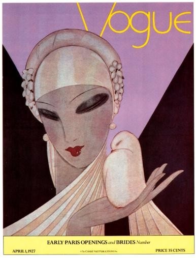
When Eduardo Benito Was in Vogue
Eduardo Benito (1891-1981) was an icon of the Art Deco era. When I was young I enjoyed seeing his work while flipping through library copies of old issues of the Art Directors Annual, a publication that taught me more than any other about the history of commercial art from the late 1920s into the 1950s.
Here is the best biographical information I could find about Benito on the Internet. It seems that magazine publishing magnate Condé Nast kept Benito busy doing covers for Vanity Fair when he wasn't producing Vogue covers for him. Not a bad gig for an illustrator from Spain.
Gallery


In the Beginning: Gustav Klimt
For a time Gustav Klimt (1862-1918) was obscure, but now he is famous if for nothing else than his gilded painting "The Kiss." If you venture into Vienna and cast about for a souvenir, you're likely to encounter one Klimt image or another unless you are truly into stocking up on Mozart candies. His Wikipedia entry is here.
As his career proceeded, Klimt's style became increasingly loose while his colors brightened. His early works were done in a highly academic fashion with a great degree of skill. From what I've seen, I'd have to conclude that Klimt could have practiced in almost any style extant in his times and would have been successful at it. Many other modernists could not handle academic style art well and, perhaps for that reason, quickly moved to modernism because there was little in the way of alternatives.
Let's take a look at some of Klimt's pre-Kiss work:
Gallery


Click on the image for a large version.

This was painted in gouache.

Here we find touches of the later Klimt such as the introduction of gilt design in the background.

The painting of the background is in a looser style.

Click on the image for a large version.

Klimt is on the cusp of abandoning his previous academic/naturalistic style for the stylized paintings best known to us today.
Believers Prepare for 2012 Olympics
 |
| Bright Fish by Kirsten Borror 2011 Mixed Media 11x11 |
Just got word last night through Christopher Clack that Run With the Fire is now available for purchase. This project was put together by a group of Christian arts organizations with the purpose of helping churches of the UK prepare ways to engage with all the visitors who will come to see the Olympic games in 2012. It is an international compilation of art from 25 artists available in a DVD. Organizers state, "This project is unique in that every participant has started their artistic journey from an idea or vision statement provided by another artist. This has created a sense of community and energy which comes through clearly in the finished pieces. Different artists, different media, different nationalities but one common purpose– to glorify God through their work." Bright Fish is my contribution to Run with the Fire, and I am so honored to be a part of it. It feeds into my hopes for believers working together to advance the Kingdom. The image is my response to South Korean Hyun Young Kim's vision statement "Jesus brings us rest and release from hopelessness, sickness and dark lies."
Blogging Note
You might have noticed that my response to comments has been slower and weaker than usual. That's because I've been traveling for most of the last two weeks. The posts you've been reading were written earlier and queued for scheduled later release. I'm writing this in artsy Taos, New Mexico and will post about it if I see anything interesting enough to merit doing so.
Design at Your Fingertips
No doubt the concept (in rudimentary form, perhaps) has been around for ages. And perhaps someone else articulated it clearly earlier, but the guy I'm aware of who built a highly successful career around ergonomics and human factors was industrial designer Henry Dreyfuss. As the result of reading his book Designing for People when I aspired to be an industrial designer, along with a lot of interaction experience with various devices in the years since, I pay a lot of attention to the quality of interaction with tools of various kinds.
This post lightly touches on the subject of computer keyboards, something I and most readers of this blog deal with often. It's not a comprehensive survey; I have some illustrations below, a few comments and a wistful conclusion. Feel free to toss in your two Euro-cents (while they last!) in our new, improved, faster publishing Comments link at the bottom.
Gallery

Early Apples integrated the keyboard with the body of the machine. I suppose this helped keep costs down a little, but it forced users to be in a fixed position while typing.

The IBM PC featured a keyboard tethered to the system unit. This allowed a user to work with the keyboard on his lap or in other convenient positions: greater freedom. The keyboard had a nice touch along with a click-clack aural feedback. I bought my PC in May, 1983 and really liked the keyboard (which was probably relatively expensive to produce).


The set of keyboards shown above indicate the variety of ergonomic and other solutions that are or have been on the market. I haven't tried any of them, so I can't comment as to their effectiveness in aiding typing. The reason I haven't tried them is because, unlike some office workers, I seldom engage in extended typing sessions on a computer. When I compose a blog post such as this I'll write a few sentences and then pause to consider what I wrote, taking my hands away from the keyboard. And, in any case, these posts aren't long. Similar thing if I'm writing a computer program: write a few lines of code and then think and perhaps run a test.
But in theory those warped-looking keyboards should be in better synch with one's body. Try dropping your hands before you on a table. Note how your forearms tend to converge, forming something like a 90 degree angle to one another. If your hands are extended, the bones of your middle finger should fall along the same axis as the forearm. But when typing on a standard keyboard, the wrists will have to turn outward a bit so that the hands can cover the board better; this breaks the fingerbone-forearm axis I just mentioned. Warped keyboards tend to preserve that axis.

I have an iMac and paid extra for this keyboard which is larger than the basic one (which is like that of a MacBook laptop computer). This keyboard has, among other additions, a key allowing for forward-deletes and a numeric pad, two features that make the extra cost worthwhile to me.

I also have one of these. For some time Apple keyboards have had flat keys that (for me, anyway) took some adjusting, though I've now adjusted my "touch" accordingly (but still don't like it). I can understand why those flat keys are used in slim laptops such as the Air; tall keys would require a thicker computer.
So why didn't Apple provide better (for me, at least) keys on desktop machines? To cut costs, probably -- though their computers are pretty pricey and probably profitable enough to warrant the added cost of a decent keyboard for iMacs.

I've only tried the iPad virtual keyboard briefly -- I used it to bring up this blog on an iPad at an Apple Store. So I know it works, but have no idea as to how well I could knock out an email or blog text using it.
Conclusion? Thirty years later, the IBM PC keyboard is still the best, though I concede the necessity for flat keys on slim laptop computers.
Phrases you might have heard - Library Renovations

If you've been keeping tags on our 365 days of a library project you'll have noticed that Camden and Narellan libraries have undergone a few renovations in the past year. From our changing displays to new furniture and installations, there's plenty more to see. In honour of the new flourishes, here's a blog post about some of the things you might have heard while these changes were going ahead.

Although not technically a renovation per se, keep your eye out for new tech in an about the library as much of it is available for patron use. Book-A-Librarian for example, allows students to use the library iPads to do research enquiries on Friday afternoons at Narellan.
1. Wait...where did the castle go?
The book castle at Narellan library lasted far longer than we expected it to. Four months into its old age, we finally had to take it apart - It was starting to lean over to one side in a drastic fashion. Patrons certainly loved it and it was great that the books got one final use before they had to go (They were so old and tatty even Lifeline wouldn't take them!).
You might have heard this phrase said by library staff who didn't notice it was gone until someone (usually a library member) pointed it out to them. Funny how something can become such a part of the environment that it almost becomes subliminal.
2. I'm certain these chairs were red when I was here last.
Camden library bought new chairs for the main thoroughfare. They were very similar to the old ones, just newer and more comfy, and most importantly, a completely different colour.
This resulted in some of the Narellan staff thinking they had gone insane when they arrived at the other library.
3. It's too early in the morning for Bibbliosaur.
Bibbliosaur has been a welcome addition to the library family since his appearance earlier in the year. Last week we found him curled over in the morning next to the DVDs. Rest assured he only required a quick visit to the dinosaur doctor (ie. an air pump).
This resulted in a number of jokes about dinoaurs not being morning reptiles.
4. If you can't find me, I'm chilling out in the shed.
As with most garages and storage rooms, the garage out the back at Narellan library had become its own peculiar kind of labyrinth. Filled with everything from Storytime supplies (Did you know that you can get crepe paper in 37 different colours?), bulk loan crates, home library service bags, library lovers t-shirts and a ream of other stuff, our team leader Luise bit the bullet and restored order to the place.
We all knew Luise was a bit of a Grand Designs fan, which included the presenter Kevin McCloud(adoringly called Kevin McStylish in our library). Library staff printed out pictures of Kevin and made masks to surprise Luise on the morning the clean-up and shelving refit was done, complete with Kevin "powerwords" (e.g. organic, invigorating, visionary, aesthetic!).
For example,

To this day, Luise retreated to the new 'shed' if she needs a peaceful moment.
5. It's the Ottoman empire! Get it? Get it? (Response: Not really).
Yeah, we bought new ottomans for Camden and Narellan. A lot of them. Hence the pun.
It wasn't as funny as some library assistants thought it was (i.e. me).
6. It's a sign! Get it? Get it? (Response: Haven't we fired you already?)
We have new signage! From the new non-fiction signs to direct you to different topics, to the browsable collections' craft letters, to the new HSC good luck signs.
Surely all these signs are a 'sign' of the library's increasing attention to making the library easier to sort through.
For the record, I have yet to be fired over my bad jokes, although I feel this may be inevitable.
7. FREEDOM!!!!
iPads! Flip Cams! Mp3 Players! We got a whole lot of new tech this year, which has given us greater freedom in what we do. The iPads are great for our reference services (looking up the catalogue without having to go back to a pc? Oh la la!), and we've started to video a lot of our seminars and activites.
Although not technically a renovation per se, keep your eye out for new tech in an about the library as much of it is available for patron use. Book-A-Librarian for example, allows students to use the library iPads to do research enquiries on Friday afternoons at Narellan.
8. What's that sound?
Why, that's a whole lot of classical music pouring out of the external speakers at Camden.
Afternoons can get a bit hectic at Camden. In a moment of genius, Virginia decided to put on some classical music at key influx periods - and noticed an instant difference. Lending followed more smoothly, everyone was calmer, and the more usual peace of Camden library prevailed.
9. You can do it online.
This might not seem like a renovation phrase but shelves under the service desk are certainly looking tidier after the introduction of online booking. Patrons can now do everything from the privacy of their own home, even at 3 in the morning.
You can even print your tickets from home!
10. RAWR!
Without fail, one person per day walks by Bibbliosaur and does a dinosaur growl under their breath.
Over 80% of these people are fully grown adults.
Yes- we can hear you.
Bunny Art
Australian painter Rupert Charles Wulsten Bunny (1864-1947) was stuck with a last name that I consider unfortunate, though I don't know his take on the matter. To me, "Bunny" is unserious. On the other hand, it's distinctive, so might have been an marketing asset.
Setting this aside, he seems to have been a skilled painter who produced some interesting works. I can't recall seeing any of his paintings either in the USA or Europe. Many are in Australia, which I've never visited. Therefore accept what I just said as a provisional take.
There is a Wikipedia entry on Bunny here, but it's quite brief. A more comprehensive biographical not is here and a short one here.
Below are examples of his work.
Gallery


These are two earlier works.


Two portraits, the upper one of the famous Australian opera singer.


Three paintings from the same period.

This was painted on his return to Paris from a visit to Australia. Note the more impressionistic style.

An even later work. Bunny seems to have believed that he wasn't Modernist so, like so many other artists of his time, made an effort. If he tried this because his earlier style wasn't selling, I can sympathize even though the result isn't as impressive as his earlier works.
Subscribe to:
Posts (Atom)