Mario Cooper and His Glamorous Touch


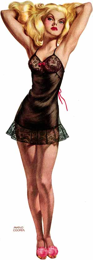
The image above is a 1930 illustration by Mario Ruben Cooper (1905-1995). Yes, there are distortions, but who cares ... I think it's terrific.

Not much information on Cooper can be found on the Internet as I write this. Here is a collection of his illustrations, and here is a memoir by his wife.

Ernest W. Watson in his 1946 book "Forty Illustrators and How They Work" sketches Cooper's career on page 71 as follows: "Mario Cooper was born in Mexico City in 1905. His father was a Californian, his mother a native of Mexico. When Mario was nine, the Coopers moved to California where the boy received his education. He studied art at the Otis Art Institute and the Chouinard School. Later he studied at Columbia University under sculptor Oronzio Maldarelli. He plunged into the professional world via engraving house, art service, and advertising agencies. He became an expert letterer and layout man. He studied drawing in night classes wherever possible and copied the work of Dean Cornwell, Harvey Dunn and Pruett Carter." His professional break occurred in 1930 when Collier's magazine, a leading general interest publication, first accepted his work. Watson mentions that Cooper's preferred media were colored inks and watercolor.

Below are a few more Cooper illustrations.

Gallery

From "The Flower Illusion" in the 26 April 1941 Collier's

A Collier's illustration - 11 October 1941

"Murder in Retrospect" - Collier's - 24 October 1941

"Patience" - Esquire magazine - 1948
This might have been for an Esquire calendar.

Lincoln 1953-58 Syling: Size Seemed to Matter

Ford Motor Company's Lincoln brand has had its ups and downs as this Wikipedia entry indicates. On very few occasions near the end of the 1990s did Lincoln sales top those of Cadillac, its main domestic luxury car rival. And for much of its existence, Lincoln was a distinct also-ran to Cadillac in sales terms.

I haven't time here to explore the entire history of the marque, instead focusing a period of exceptional interest from a styling standpoint, the middle part of the 1950s decade. To set the scene, Lincoln's first post- World War 2 restyling yielded 1949 models based on two basic bodies. One body was shared with the 1949 Mercury. The other, larger body was for the Lincoln Cosmopolitan and unique to the brand. 1952 marked the next complete restyling. The large Lincoln was abandoned and bodies were shared with Mercury, resulting in a comparatively small car at a time when top-of-the-line cars were expected to be larger than average.

Gallery

1953
This is a mild face-lift of the 1952s. It is an attractive design that was quite modern at the time, especially the low hood feature. Also stylish was the fake airscoop on the rear part of the side. It was a decorative element intended to break up otherwise potentially plain, tall sides. Ford and Mercury also sported fake side airscoops.

1954
The next model year found the fake airscoop reduced to a bulge, the chrome strip defining the location of the notional air entry point being replaced by horizontal chrome strips intended to make the car seem longer.

1955
To my eyes, the 1955 Lincoln was the last and best looking of its cars based on the 1952 body. The side bulge has been reshaped in a racier manner. Headlight bezels are now extended ahead of the headlamp faces (the term for this was "Frenching"), slightly physically lengthening the car. Further lengthening was due to redesigning the tail-light assembly as part of a rear fender extension.

1956
Cadillac came up with a (for the time) futuristic new body design for the 1954 model year. Cadillacs were more squared-off (less voluptuous) than for 1953, but the big styling innovation was the wraparound windshield. It took Lincoln two model years to catch up with this total re-design. The 1956 Lincoln was much larger than in 1955, yet was a clean, attractive design.

1957
Sales of nearly all 1956 model year cars were disappointing compared to record-setting 1955 sales. Lincoln management fought back with a major face-lift even though its restyled 1956s outsold its aging 1955s. I always thought the 1957 facelift was an aesthetic disaster, but the cars sold better than in 1956.

1958
For 1958, Lincolns were totally restyled again, this time being based on a huge, heavy unitized body. The result was aesthetically better than for 1957, but not as nice as the 1955s and 1956s. Sales were down, however.

Spiritual Battle of St. Anthony


North River Gallery, New England Christian art
The Temptation of St. Anthony by A. Gassel


The Temptation of St.
Anthony


There are multiple Catholic paintings of this across Europe. St. Anthony was in the caves, living
in the desert, near the cemetery. He came under the attack of demons. The Devil
approached St. Anthony with the face of a beautiful woman. Could it be he was
in love with a young lady, against his desire to be a celibate man dedicated to
God?  He was the founder of the first
structured Christian communities known as monasteries in the 4th
century. The sliver of light shining on his head is the source of his defense
against the forces of Death. It is the light of God supporting him.

A Not-So-Good Design

The great industrial designer Henry Dreyfuss (1904-1972) was especially concerned with "human factors" or "ergonomics" when designing a product. The idea was to made the item easy to understand and use. It also should be compatible with the physical dimensions and manipulation capabilities of the user. Finally, it should do its job well.

Vacationing at a fancy resort in the Hawaiian island of Kauai recently, I encountered something that failed on more than one of those criteria just mentioned. Here it is:


Apparently the resort refurbished its early 1960s-vintage buildings in the 1990s. Hotel rooms were smaller around 1960, so the modernization had to make do with available space. This was especially the case with the small bathroom area.

My problem had to do with the sink arrangement shown above. The style of sink that projects above the counter top was never my favorite, but it makes sense here. That's because toothbrushes, lipstick cases and other odds and ends can migrate under the sink's edge. The effect is to increase the usable amount of counter space compared to a normal sunken sink of the same size.

The failure has to do with the faucet. It doesn't extend far enough over the sink. Drawing a glass of water, brushing teeth, washing hands and all the other chores one does over a sink are harder and messier to do because the stream of water is too close to the side of the sink. Ideally, the water should fall near the drain hole rather than on the shallow slope of the sink's side.

So what we have here is a faucet design that's functionally not compatible with the design of the sink. One solution would have been to install a sink with steeper sides to better accommodate the water stream. But that would have meant a sunken sink and less counter space. The better solution would have been a faucet with a longer stem that would reach farther into the sink area. Maybe none were available at the time; I have no idea. Regardless, we were stuck with the result of decisions made years ago.

No Limits to the Wholeness He Brings


Family Island detail, by A. Gassel

But there'll be no darkness for those who were in trouble... what was in disrepute will He make glorious.

The people who walked in darkness have seen a great light.

For those who lived in a land of deep shadows--

light! Sunbursts of light!

You repopulated the nation, you expanded its joy.

Oh, they're so glad in Your presence!

Festival joy! The joy of a great celebration,

sharing rich gifts and warm greetings.

The abuse of oppressors and cruelty of tyrants--

all their whips and cudgels and curses--

is gone, done away with, a deliverance

as surprising and suddn as Gideon's old victory over Midian.

The boots of all those invading troops, along with their shirts soaked with innocent blood,

Will be piled in a heap and burned, a fire that will burn for days!

For a child has been born--for us!

The gift of a son--for us!

He'll take over the running of the world.

His names will be: Amazing Counselor, Strong God, Eternal Father, Prince of Wholeness.

His ruling authority will grow, and there'll be no limits to the wholeness He brings. Isaiah 9


What I'm Up To


In 2012 I finally finished "Art Adrift" and had it published as an e-book on Amazon. The publishing process, once I learned it, was simple enough that I decided to write more books.

As 2012 draws to a close, I'm working on a book about American automobile styling. I posit two periods when the appearance of cars was evolutionary. Otherwise, aside from occasional exogenous nudges due to technological advances and government regulations, automobile styling has been far more a matter of fashion than design in the pure, ideal sense. The book will be richly illustrated to show the reader how my thesis applies.

While that is going on, I'm mulling about a book dealing with the early 20th century ideology/religion of Functionalism as applied to the fields of industrial design and architecture. No real thesis yet, but I'm collecting material on the subject.

And it also seems that I'm done yet done with Art Adrift. I recently read a couple of chapters and spotted enough typos needing correction to persuade me to do a clean-up to have in place for new purchasers before the end of the year. It's available now.

Dragon Slayer is Coming


St. George and the Dragon by A. Gassel


St. George is traveling through a country and
comes across a woman in danger. She is a princess held captive by a dragon. He
rescues her by killing the dragon.  It is
a classical story about right action in the world. Every Knight had to kill 10
dragons. Battling the bad force, protecting the vulnerable, these are masculine behaviors and doing battle 10 times means you've proven your heart is honorable. We always have
dragons among us and within us we need to battle, because this world is not perfect. The Devil can take any form he wants and we don’t know
what side he may come, but we know he will always find your weak point. You can
always push him away. It depends on you.


Jesus is the ultimate dragon slayer. Come see this work along with 18 others at North River Gallery when you come to Christmas Eve services, December 24 at 3pm and 5pm.


Cerramos este año intenso de actividades que nutrieron mi espíritu, encuentros de arte público, jornadas de pensamiento latinoamericano, murales en homenaje a escritores queridos postergados u olvidados. Un año que parecería insuperable en cuanto a las propuestas surgidas en todos los rincones de nuestramérica.
Sobre fines de Noviembre hemos organizado con los integrantes del Grupo Gambartes y Mariana Utrero de la Secretaria de Cultura del Municipio de Mendoza, el 2° Encuentro de Arte Público y Educación, que contó con la presencia de excelentes artistas plásticos y amigos, de Mendoza. Junto a ellos diseñamos la segunda etapa del Gran mural colectivo del Parque Central mendocino, en técnica de Mosaico; homenajeando a las culturas originarias de la región. Cunpliendo en tiempo récord con todos los trayectos estipulados, diseñamos el boceto, hicimos el mural y nos dimos tiempo para ver documentales y debatir sobre arte y política junto a Diego Ruiz, nuestro licenciado en comunicación que se especializa en arte público y política, cerrando el encuentro con un asadazo con baile folclórico y todo. Sin duda un encuentro memorable, que pretende reforzar el trabajo colectivo de la comunidad mendocina.
Ya volviendo, tuve el honor de ser invitado a realizar una disertación sobre el encuadre de mi trabajo como organizador y como artista en una mesa integrada por Florencia Kusch, Juan Pablo Berch,entre otras celebridades académicas, en el marco de las 3° JORNADAS DEL PENSAMIENTO DE RODOLFO KUSCH, organizadas por la Universidad Nacional de Tres de Febrero en el Salón Belgrano de Senado de la Nación, un lujo y una arriesgada invitación por parte de Pepe Tasat y Juan Pablo Pérez, al proponerme compartir mis experiencias ante la comunidad universitaria, gracias a ambos.
Empezaremos el 2013 con el 1°Seminario de Verano de Muralismo en el Patio "La Margarita" en Villa Urquiza, así que no tenemos vacaciones. Salute y buen fin de año para todos.


Elijah in the Chariot of Fire


Christian Art MA, North River Gallery
Detail of Ascension of Elijah by A. Gassel

This is a detail of a larger, traditional depiction of the prophet Elijah being taken into heaven by God's chariot. Come see the whole painting at North River Gallery. See page above for gallery information.

The story is told in 2Kings 2 "As [ Elijah and Elisha the protege of Elijah] were walking along and talking together, suddenly  a chariot of fire and horses of fire appeared and separated the two of them, and Elijah went up to heaven in a whirlwind."

Family Island


Detail from Family Islands by A. Gassel


Alexander Gassel does paintings which are in the style of Medieval and Early Renaissance painting, but he does not limit himself to Biblical themes alone. There are a few paintings on view at North River Gallery (See page above) which are commentaries on contemporary culture including Family Islands which has multiple figure groupings in it. It is a reflection on what it is to be a family in the
United States. “The family builds islands of love where they live and love
together. Life is inside the family, and wherever one may go, the family is not
apart from them, it is carried with them and they always return to the family. In the old country (rural Russia prior to 1980) all people knew each other. A whole village could be
relatives. But in the USA, people live separately, like islands. A village back then may
have only 20 houses. If one drinks, the whole village knows it.”

Premio al proyecto Curadora- Residencia para artistas

Convocatoria 2012 Espacio Santafesino + Ministerio de Innovación y Cultura de la Provincia de Santa Fe


Turner Prize Finalists 2012


For the United Kingdom's avant-garde art world, the Annual Big Deal is the Turner Prize, named after the 19th century painter J.M.W. Turner, who many art historians regard as a precursor of modernist art because of the semi-abstract quality of large areas of many of his later paintings.

The Turner Prize is only one of several important scheduled events that reveal the present Modernist Art Establishment take on what art ought to be. But for what it's worth, here is a link to the 2012 prize finalists with the winner identified.

I find it interesting that only one of the four finalist works involved graphic art. The other three involve Installation, film and video (as best I can tell from the citations). None of the finals painted in oil.

This serves to help confirm the speculation in the final chapter of my book, Art Adrift, that self-styled avant-gardists had to abandon painting for other media because there was little room for major innovation in painting after 1920 or thereabouts.

F.C.B. Cadell's Nearly Faceless Faces


F.C.B. (Francis Campbell Boileau) Cadell (1883-1937) was a member of the Scottish Colourists, an informal group active in the early decades of the 20th Century. I wrote abut him here, and his Wikipedia entry is here.

In August when I was browsing Glasgow's Kelvingrove Art Gallery, I got to see some of his paintings in person for the first time. Although it's actually pretty obvious even when inspecting reproductions, for some reason it struck me at Kelvingrove that many of Cadell's paintings feature sketchy treatments of facial features. He might have done this so that faces would not grab viewers' attention from the entire painting. Or perhaps he had another reason; I don't know what was on his mind.

Below are images of some Cadell paintings found on the Internet with close-up photos of facial detail I took at Kelvingrove.

Gallery


Reflections (Girl in Blue) - c.1912


Reflections - c.1915


A Lady in Black - c.1925


The Orange Blind - c.1925

Early Fortune Magazine Cover Art


The business magazine Fortune was launched by Henry Luce's Time, Inc. in February 1930, only a few months after the October 1929 stock market crash that set off the Great Depression. While the timing seems poor in light of history, the concept surely made some sense during the period when the magazine was being planned.

Surprisingly, the magazine wasn't scrubbed as the Depression was dragging on far longer than originally thought. I don't know if or when it became profitable, but Luce stuck with it until prosperity finally returned. As I write this, it is still being published.

Fortune in its first decade or so was a classy publication. It was printed on thick, quality stock and illustrated by some of America's best illustrators and photographers. It was priced at $1 per copy or $10 for a yearly subscription. According to an inflation calculator I just accessed, those values translate into about $14 and $140 in 2012 dollars. On the high side, but not impossibly so.

Below are some covers from 1930 into 1940.

Gallery

February, 1930
The first issue. Pictured seems to be a wheel of fortune adorned with Zodiac symbols.

August, 1933
The cover illustration was made by Ernest Hamlin Baker who did many portraits for Time magazine covers.

May, 1934

May, 1936
Illustration by John Cook.

February, 1938
Illustration by Alan Atkins.

September, 1940
By the start of the 1940s, Fortune was using photography for cover art. The aircraft pictured is a Douglas B-18 of the Army Air Corps' 9th Bomber Squadron based at March Field in southern California. By the time this Fortune cover was printed, the squadron was converting to B-17s.