27 MAR, 2011, 02.54AM IST, NALINI S MALAVIYA,ET BUREAU
These days, many artists are moving away from traditional media such as oil and acrylic on canvas or watercolours, and are experimenting and innovating with various materials. Mixed media paintings or installations have become the in-thing and are increasingly growing in popularity. These are exciting to view and often feature creative uses of different materials to present the concept.
However, for the buyer, it is important to verify or at least be aware of the materials, which have been used as part of the artwork. This will give an idea as to whether these will maintain status quo, or if there is a probability that one or more of the materials could decompose, decay or rust, change colour or texture due to oxidation or reduction based on environmental conditions.
While some of these changes may be desirable (adding interesting dimensions to texture or patina), those that affect the monetary worth of the artwork could be unwelcome. In fact, there might be instances where one may not be able to foresee some of the changes that may happen in the future. Over the years, a lot of research has taken place to improve the quality of paints, pigments and canvases to ensure that they are longer lasting.
But when artists use 'different' and new materials, which are not as common in artworks, there has to be a conscious effort made towards ensuring the longevity of the product. This could be done either by treating these materials appropriately or by substituting them with similar but hardier materials. Therefore, while it might be exciting to view artworks made out of interesting materials, as a buyer, one needs to be aware of their condition and expected lifespan.
Fortunately, just as many painters have adopted the use of finest quality materials in their paintings, most new media artists too put in a lot of effort in using the best quality materials. Still, as a buyer, there is no harm in being aware and then taking an informed decision.
Irwin Caplan (1919-2007) was a well-known magazine cartoonist during the final glory years of the "slick" general-interest magazines. As his Wikipedia entry indicates, Caplan practiced a good deal more art and design than those cartoons. But it was the cartoons that most people knew about.
In the pre-Internet age it wasn't so easy to locate information about people, so that's why I was surprised regarding all his non-cartooning accomplishments when reading the link above. You see, I encountered him Way Back When.
I was majoring in commercial art at the University of Washington and one of the classes in that field was Fashion Illustration. And our instructor was ... Irwin Caplan, of all people: the famous cartoonist.
A slight problem I had with that was a lack of credibility: What did he know about fashion illustration? Perhaps sensing this, one day he brought in a newspaper clipping of a small advertisement for a blouse where the illustration was a wash drawing by Himself. He told us that even though the illustration was small, it was his and it got published, so he was proud of that.
That helped some, but we were most pleased when he brought in his buddy (and well-known local fashion and general-purpose illustrator) Ted Rand and his lovely wife for a demonstration. Oh, how jaded and snobbish we were in our student days!
Artist Atul Dodiya’s talk will be about the diverse influences, references and quotations in his work; why he chooses a specific genre; shifts and change in the media that he uses, and the ways in which he addresses the political, social and personal traumas within his painterly practice.
About the speaker : Atul Dodiya
Atul Dodiya (b. 1959 ) studied at the Sir J J School of Art, Mumbai and the Ecole des Beaux-Arts, Paris.
Dodiya’s allegorical paintings on canvas, paper and metal shutters draw on diverse traditions in painting and text. He works with unusual materials and techniques and brings to the viewer a palimpsest of images and a collage of experiences. Dodiya’s art is marked by kaleidoscopic quotation and his pictorial narratives are taken from iconic images from global visual culture- cinema stills, cartoon strips, popular oleographs, the homegrown version of MAD comics-all intertwined with autobiography. His intricate and multi-layered pictures work like a jigsaw of ideas that have been put together with humour and irony.
Atul Dodiya has had 25 solo shows in India and abroad, and this includes a mid-career retrospective at Japan Foundation Asia Centre, Tokyo in 2001 and a solo show in Reina Sofia Museum, Madrid in 2002. Dodiya participated in the 1st Yokohoma Triennale, 51st Venice Biennale, Documenta 12, 7th Gwangju Biennale & the 3rd Moscow Biennale. Dodiya lives and works in Bombay, India
About the lecture series : Practices in Contemporary Art & Architecture
Practices in Contemporary Art & Architecture Lecture Series has been initiated by CoLab Art & Architecture, Goethe-Institut/Max Mueller Bhavan, Bangalore in collaboration with the Venkatappa Art Gallery, Bangalore. Spread over a year with one lecture a month, the visual art series focuses on practitioners who look at both ‘reconstruction’ and the ‘historical turn’ from the perspective of contemporary artistic practice: the revisions and re-readings that take place when images, works or events from the past circulate in a changing set of configurations ; the lectures on architecture will attempt to look at the radical shift in the imagining of the public space and the notion of spatial equity, and the questions thus raised.
El 16 de Mayo de 2009 en la Entrada sobre Cerámica Antigua del Suroeste de Norteamérica realizada para este blog, hice el comentario de la satisfacción que tiene que sentir un arqueólogo al encontrar cerámica en un yacimiento.
PERFECTA VASIJA NAZCA CON DECORACIÓN EVOCANDO AVES
No hay duda de que la cerámica en muchas civilizaciones ha supuesto algo así como el testimonio más real y mejor conservado de una cultura. Me atrevería a decir que encontrar cerámica es como encontrar el relato escrito de un pueblo, con la ventaja de que su conservación suele ser, sino perfecta, muy buena.
Hasta este blog he traído la ya mencionada cerámica antigua de Norteamérica, también he hablado del trabajo tribal de la cerámica en Nigeria (6.6.09) y hasta hemos visto cerámica como el Rakú, que tiene sus raíces en las ancestrales ceremonias del té de Japón.
OTRO BELLO EJEMPLO CON BOCA ANCHA Y TONALIDAD ROJIZA
Hoy me atrevo a hacer la incursión en las culturas más antiguas del Continente Americano, y como no podía ser de otro modo, en su representación artística más impactante: la Cerámica.Y para comenzar este itinerario americano he decidido realizar un pequeño resumen sobre una de las más bellas de todas ellas. La cerámica Nazca.
Los expertos dividen esta cultura en diversos periodos pero no voy a extenderme en estas divisiones, diré simplemente que su desarrollo se correspondería con los años entre 100 aC y 700 dC. , que la podemos situar en el desértico Sur de Perú y que en un momento coincide con la cultura Moche del Norte del mismo país, de la que hablaré en días posteriores.
Aunque esta cultura desarrolló sofisticados sistemas de irrigación, trabajaron la agricultura con éxito y también sabemos que realizaron una arquitectura, algo modesta pero digna de señalar, no es mi intención detenerme en ello. El objetivo de la entrada es, como ya he mencionado, hablar sobre lo que se conoce como la mayor manifestación artística de esta cultura. Su cerámica.
VASIJA MODELADA CON FORMA DE PEZ O MONSTRUO MARINO
Hay varias divisiones establecidas para estudiar el desarrollo de esta manifestación. Una de ellas es la que establece cinco fases: Protonazca (200-100 a. C.), donde existen muchos motivos propios de la cerámica de la denominada cultura Paracas; Nazca temprano (100 a. C.-200 d. C.), donde se aprecia elementos de un nuevo estilo; Nazca medio (200-300 d. C.), en los que se ven motivos cada vez más simbólicos; Nazca tardío (300-600 d. C.), en los que predominan los motivos complejos; y Nazca final (600-700 d. C.) en la que podría decirse que comienza un declive de este esplendor, aunque algunos historiadores marcan este deterioro con anterioridad, concretamente hacia el Nazca medio en que las formas comienzan a perder perfección, y las líneas son menos precisas y finas.
CUENCO DE PAREDES ALTAS CON DECORACIÓN DE GUERREROS
Hay mucho que decir sobre esta representación artística, más aún si se es ceramista. No podemos por menos que quedar prendados del preciosismo de las piezas, su estilismo, su policromía, en una palabra, de su perfecta realización. Sin duda lo que más llama la atención es su exquisita decoración. La riquísima gama de colores se lograba con elementos minerales finamente molidos y mezclados posiblemente con savia o simplemente con agua que se aplicaban en las piezas antes de su cocción, de lo cual deducimos que se hacía a modo de engobe. Su cuidado pulido conseguía producir un brillo que no envidiaba a los colores de la cerámica vidriada que todos conocemos, a la vez que lograba la impermeabilización de la pieza.
VASIJA CON DOBLE PITORRO Y ASA PUENTE-DECORACIÓN NATURALISTA
Posiblemente esta savia mezclada con los minerales era el propio fundente. Unido todo ello a las diferentes arcillas que se utilizaban, daba como resultado toda una gama de coloridos como el negro, blanco, gris, amarillo, rojo, violeta, y marrón en diversas tonalidades. También hay que mencionar los dibujos de decoración de una gran perfección.
VASO CON BOCA MODELADA Y MUY DECORADA
En cuanto a la cocción, con toda seguridad se llevaría a cabo en hornos semi-abiertos para conseguir una atmósfera oxidante que no oscureciese las piezas y poder lograr esa pureza y limpieza de colores, algo que demuestra que también tenían un gran control del fuego de la hornada. Esto es una prueba más de que el ceramista sería alguien dedicado exclusivamente a ese trabajo. Un experto en el oficio.
Aunque en general la decoración se realizaba con una delineación en negro (posiblemente manganeso o un óxido similar) y se rellenaba con los otros colores para después pulirse, los motivos variaron en cada fase o época. En un principio predominaron las decoraciones geométricas y abundantes espirales.
VASIJA CON CABEZA MODELADA Y PITORRO UNIDO POR ASA PUENTE
También encontramos numerosos motivos naturalistas como vegetales o plantas que utilizaban para su cultivo como el maíz o la yuta y también diferentes animales. Hay una amplia representación de estos, desde pelícanos, colibríes loros, peces y hasta arañas. Las representaciones de figuras humanas nos dejan descrito cuales serían sus ropajes y costumbres así como sus tendencias guerreras o la manera de cultivar.
DECORACIÓN CON ANIMALES MARINOS, POSIBLEMENTE ORCAS
Para su modelado se han clasificado hasta un número de siete arcillas diferentes. Se mezclaba, en ocasiones, con finas conchas molidas a modo de chamota (elemento refractario) que hace más resistente la pasta.
FIGURA CUIDADOSAMENTE MODELADA SEMEJANDO UN ANIMAL MARINO
Se han encontrado representadas cabezas cortadas que pueden asociarse a sus prácticas guerreras. En otras representaciones podemos apreciar aspectos más humanizados que podrían estar asociadas a algún dios supremo.
Sus formas son sencillas, pero no por eso debemos pensar que no tienen dificultad. Observemos que en su gran mayoría son piezas redondas como jarras, vasos, vasijas, en una palabra piezas redondas. Y esto es una prueba más del perfeccionismo de estos ceramistas. La rueda no era conocida en América, y cuando digo la rueda me extiendo a todos los ámbitos. Es decir, se modelaba a mano. El torno ha sido inexistente en las culturas pre-colombinas. No hace falta ninguna palabra para reconocer la perfección del trabajo. Es suficiente admirar una de estas vasijas.
VASIJA DE BOCA ANCHA PERFECTAMENTE DECORADA Y PULIDA
Las piezas modeladas, en ocasiones, son representaciones mixtas entre figuras humanas y animales que son de más difícil interpretación. Algunos de los vasos pueden terminarcon una figura modelada en su boca.
VASIJA ALTA CON BOCA EN FORMA DE CABEZA
Las formas redondeadas, en general, se cierran con uno o dos pitorros. En este último caso los dos son unidos por un “asa puente”, pieza muy característica de esta cultura.
No hay duda de que la cerámica Nazca es la escritura de un pueblo, de una cultura artísticamente muy rica. Dicen los expertos que la cerámica Nazca con su riqueza de colorido y delicados dibujos es más para ver, y la Moche o Mochica de la que también tendremos aquí testimonio, es más para tocar en referencia a su más modesta policromía pero su esmerada escultura.
VASIJA CON ASA PUENTE
Todas las culturas han dejado un gran testimonio por medio de las piezas realizadas con las manos, pero no hay duda de que las culturas llamadas precolombinas tienen en esta manifestación artística una riqueza que en muchas ocasiones no ha sido demasiado conocida ni apreciada. Sirva este pequeño artículo para que todos compartamos la maravilla que nos dejaros los pueblos de América.
En la lista de enlaces de este blog aparece la página del Museo Precolombino de Chile que os vuelvo a indicar aquí abajo. Esta página, cuidadosamente realizada, nos da opción a “pasear” por las culturas pre-colombinas y lo hace con la garantía de un museo que os recomiendo vivamente visitar si tenéis opción de viajar a Santiago de Chile.
NOTA: Para mejor visualizar la fotografía “picar” con el ratón encima de las que interesen.
Para la lectura de entradas anteriores, ir a la ventana de la derecha y “picar” en los años y meses. Se desplegarán los títulos correspondientes a cada fecha.
Me he servido para este pequeño resumen de las siguientes Fuentes:
Historia de la Cerámica. Emmanuel Cooper. (Edit.Ceac)
Curso-conferencia impartido en el Museo Romano de Irún (Gipuzkoa) bajo el título de Grandes Tesoros de la Arqueología Americana. (Año 2011)
La cerámica esotérica. Jorge Fernández Chiti. (Edic.Condorhuasi)
Escultura cerámica y mural. Jorge Fernández Chiti (Edic.condorhuasi)
Web del Museo Precolombino de Santiago de Chile.
Para la fotografía: las mismas , la red y archivo propio
While on my gallery crawl along Palm Desert's El Paseo I came across some paintings that seemed very like the work of Joaquin Sorolla. But they weren't, of course.
Information on the plaque indicated that the artist was Giner Bueno (1935 - ). And a little Internet digging revealed (click on the link) that he, like Sorolla, was born in the Valencia area. This link notes that his father, Luis Giner Vallas, was a protege of Sorolla.
Below are some examples of Giner Bueno's work.
Gallery
Al Mediodia
Maternidad
La Pesca
El Regreso Scenes similar to Sorolla's along with minor theme variation.
En Chelva Giner didn't spend all his time on the shore.
Las Zapatillas Rosa And not everything he does are outdoors scenes.
[Scratches head, rubs chin] Oh dear. What to make of this. Well, the Giner Bueno paintings I saw were small compared to Sorolla's -- the latter's canvases could have propelled half the Spanish Armada.
Giner's paintings are competently done, and I'm pleased that a representational painter of his generation has made a successful career in the teeth of modernism. On the other hand, his work is just too similar to that of Sorolla for my taste; I see Giner and think Sorolla.
Then there is the Valencia factor, if indeed there is one, that might be called in Giner's support. I've never visited that corner of Spain, but can believe in the possibility that the scene is such that it can dominate any artist who attempts to depict it. Such is the case for California, where painters for the past 120-odd years have been producing paintings that are similar thanks to the subjects. (Though there is no California Impressionist whose work is dominant, unlike the case of Sorolla in Valencia.)
L.N. Tallur: “Chromatophobia: The Fear of Money” April 4th to 30th, 2011 Exhibition opens on Sunday, April 3rd from 6 to 8pm.
Nature Morte, A-1 Neeti Bagh New Delhi
Nature Morte is pleased to present an exhibition of new sculptures by L.N. Tallur. The title ironically situates the artist’s practice within the intersections of desire, value, pedigree and psychology. Known for his kinetic sculptures which often comment on society and politics, the work of L.N. Tallur combines a sharp wit along with a prodigious use of materials.
Many of the works in the exhibition use the classical sculpture of India as their starting points. These “found objects” are then combined and manipulated, confounding the established categorizations with which we usually interpret art: figuration and abstraction, traditional and contemporary, decorative and functional, creative and destructive, religious and secular. It is as if each work is both and neither at the same time. Tallur’s works may appear quintessentially “Indian” at first, but they certainly participate in the most advanced dialogues surrounding sculpture today and reveal themselves to be both cosmopolitan and historically astute.
L.N. Tallur was born in 1971 in the south Indian state of Karnataka. He received a BFA degree in painting from the Chamarajendra Academy of Visual Arts in Mysore in 1996, an MFA degree in museology from the MS University in Baroda in 1998, and an MA in Fine Art from the Metropolitan University in Leeds, UK, in 2002. Solo shows of his works have been mounted at Arario Gallery, Beijing (2010); Chemould Prescott Road, Mumbai (2009); Arario Gallery, New York (2008); Arario Gallery, Seoul (2007); Bose Pacia, New York (2000); and Chemould Gallery, Mumbai (1999). In addition to receiving the Sanskriti Award from the Sanskriti Foundation of New Delhi in 2003 and having his works included in many group exhibitions around the world, Tallur’s large-scale installation entitled “Souvenir Maker” was recently exhibited at the Devi Foundation in Gurgaon and the Museum of Contemporary Art in Singapore. The artist currently divides his time between India and South Korea.
"LA EXPOSICIÓN MURALES TTG EN EL MUSEO GURVICH PERMITE REFLEXIONAR SOBRE TEMAS POCO DISCUTIDOS EN EL ÁMBITO CULTURAL URUGUAYO: EL PAPEL DEL ARTE PÚBLICO, EN EL QUE EL MURAL COMO FORMA ARTÍSTICA TIENE UNA POSICIÓN CENTRAL, ASÍ COMO SOBRE LA RELACIÓN DEL ARTE PÚBLICO CON INSTANCIAS PÚBLICAS Y PRIVADAS..."
Interesante comienzo de un artículo de pedro da cruz sobre murales del Taller Torres garcía de uruguay.
CIRCUS SKILLS WORKSHOP Come along and learn how to ride a unicycle, juggle, walk on stilts, spin plates and other fun activities. DATE Tuesday 19 April TIME 2pm to 3.30pm LOCATION Narellan Library COST Free – BOOKINGS ESSENTIAL AGES 8 to 14 years.
AUTHOR/CREATIVE WRITING WORKSHOP In this workshop participants will learn skills on how to write stories. DATE Wednesday 20 April TIME 3.00pm to 4.00pm LOCATION Camden Library COST Free – BOOKINGS ESSENTIAL AGES 8 -14 years
SONG WRITING WORKSHOP In this workshop participants will learn techniques and skills on how to create and write songs. Some musical knowledge and experience would be beneficial. For more details contact Freya Jobins on 4645 5057. DATE Thursday 21 April TIME 10am to 1pm LOCATION Narellan Library COST $5 (Payment at time of booking) – BOOKINGS ESSENTIAL AGES 13 - 18 years
URBAN ART DESIGN In this workshop participants will learn technique, design and use of colour. For more details contact Freya Jobins on 4645 5057. DATE Thursday 21st April 2011 TIME 9.30am to 3.30pm LOCATION Participants will be notified the day before. COST $10 (Payment and bookings made @ Arty Caf) – BOOKINGS ESSENTIAL AGES 14 years +
Contact the library on 4645 5039 (Narellan) or 4654 7951 (Camden) to place bookings.
Aperture Gallery and sepia EYE are pleased to announce Wind, a solo exhibition by internationally acclaimed photographer Jungjin Lee featuring twenty-five stunning panoramic landscapes. A limited-edition artist book, as well as the artist’s first trade book, co-published by Aperture and sepia, accompany the exhibition. Beautiful in their composition and physical execution, Lee’s images present metaphors for an interior state of being and the forces that shape it. Lee’s landscapes are imbued with an elemental vastness, at once powerful and serene.
A lecture and discussion with author Vicki Goldberg and Jungjin Lee will take place on Saturday, March 26, 2–4pm, followed by a book signing. The Wind exhibition will coincide with the annual Asian Contemporary Art Week (ACAW) festivities held in New York. Museums, galleries, curators, and artists will be involved through the ten-day run of the festival.
Automobile styling has become considerably internationalized in recent decades. In the 1930s, 40s, 50s and even the 1960s American, English, French, German and Italian cars tended to have a national "look" or flavor. (Yes, I can cite exceptions, but I hope you can see my point.)
Nowadays young people from automobile-building countries can attend design schools in the USA, England and the continent, receiving comparable training. That is, the outcome is approximately the same regardless of country of origin or country of school. If a car design turns up with a strong national character, that's because it was the stylist's intention. A case in point was the original version of the Audi TT sports car which was styled by an American, yet somehow evokes German racing cars of the late 1930s.
National character was apparent in Asiatic vehicles of the late 1950s. Since few were exported to America and Europe, readers might not be aware of that was going on at that time and place, hence this post.
The Japanese automobile industry didn't begin taking off until the mid-1950s. Its cars were often derived from English models, and the designers were probably mostly home-grown. The result for a few years was cars with curiously fussy front ends. I say "curiously" because traditional Japanese architecture and painting tends to be rather spare and simple.
But -- who knows? -- I might well be totally wrong about all this. So give the pictures below a peek and decide for yourself.
Gallery
Korean buses at Hongcheon, 1960 I found this image someplace on the web and was glad I did because it shows Korean buses as I remember them from my army days. Note that each one has a fussy grille that differs from the others. These grilles were probably cobbled together at the assembly point without the input of a trained designer.
Toyopet Crown This is a Toyota from the mid-late 1950s. Whereas the grille design in general isn't greatly at odds with European or American styling practice of the time, its proportioning and execution are awkward and a tad fussy.
Toyopet Crown from the same era The front end of this Toyota is tidier, but the design elements strike me as over-detailed for a car of its small size.
Nissan Prince Skyline ALSI-2 from around 1958 Another awkward design. Here we find round and rectangular elements that fight each other -- in particular, these round lights at the outer edges of the grille butting up against rectangular lights.
Dear Readers,
I'm back to writing a weekly column, every Sunday for Financial Times, Bangalore (it was a fortnightly for the last one year). It will continue to be related to the art market, but will renew focus on the region. Do mail me your feedback and suggestions on nalini(dot)indianart(at)gmail(dot)com.
Pl send me information on events and updates in jpg or bmp format (low res), which are easier to upload on the blog. Pdf files are great if they are just for keeping me informed, but do send another low res jpg file for uploading.
You may have noticed the recent changes on this site in design and layout, do let me have your feedback regarding them.
Incidentally, this is my 820th post since the year 2006... it is your interest in this blog and encouragement over the years that has kept me going...looking forward to your continued support.
I posted recently about my visit to the Arts Festival at La Quinta, California and mentioned that an artist's work gave enough food for thought to inspire a future article. Well, the future is now.
The artist was Beverly Wilson who paints bright California scenes that often include strong purple shadows, as can be seen in the picture below.
As mentioned in the earlier post, I thought the art show had an above-average quality level for that kind of event. And I'll add that I think Wilson was among the better painters there. However, I also think she goes a little too heavy when it comes to those purple shadows. Yes, it's a means to distinguish her paintings from the rest of the crowd, but the effect detracts a little from what her paintings might have been had she dialed back on the purple.
Sometimes an artist with a distinctive -- even highly marketable -- style should consider dialing back in the name of improved quality.
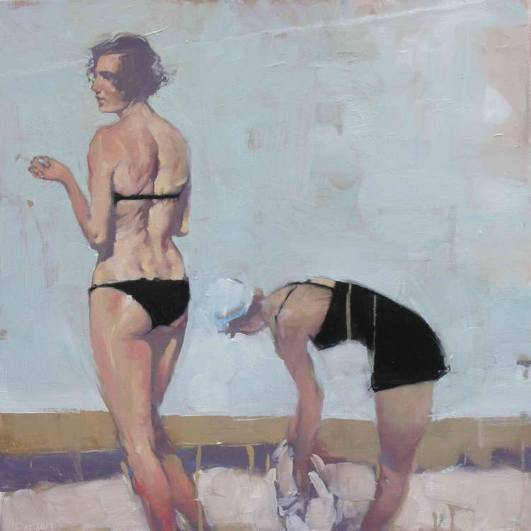
One artist who recently tried this is Michael Carson. Below are examples of his career-building style and recent works, a few of which I noticed in a gallery in Palm Desert, California about the same time I took in the Arts Festival.
Gallery
Many of Carson's early paintings were party scenes containing people with exaggerated expressions.
Most of his paintings feature women. These are typical of his previous style: mural-style outlining, skin painted richly with occasional highlight spots as if the subjects had a slightly greasy surface.
I'm not sure of this, but these two paintings strike me as being transitional between the style seen above and his new style, below.
Recent Carsons have lost the bright, shiny skin surfaces. The brightness has faded towards gray. Highlight areas remain, but their impact is reduced thanks to the change of color key.
This painting is similar to what I saw in the Palm Desert gallery. More subtle skin color offset by stark blacks of the subject's clothing.
Carson's recent paintings are becoming a far cry from those early party scenes: he's done a lot of dialing back. To his benefit, I think.
Castle your way to victory at chess club at Narellan library. For the first time, on Wednesday 30th of March, Narellan library will be hosting chess club for all ages from 4-7pm. Youth, Children and adults are all welcome. No bookings required, just turn up on the day! We'll be setting up multiple tables in the magazine area, so you won't miss it as your enter the library doors.
Tea and coffee will be available. Any questions contact Narellan library on (02) 4645 5039.
Some more shows in the city - Rameshwar Singh at Crimson Art Resource & Manju Hassan at 1 Shanti Road.
Incidentally, the latter ends on 25th this week and I must catch it before that as the images Manju sent have piqued my interest! I have to say I am a little surprised at the venue - a paintings exhibition at Suresh Jayaram's place - that's a rare phenomenon!!! Those of you who are familiar with 1 Shanthi Road will know that it is 'the place' for experimental art and a wonderful space that nurtures alternative art practices.
The 1950s and 60s saw major changes in mainstream illustration style. Conventional wisdom has it that photography began to force illustrators to move from highly representational style. For this and other reasons (advent of television, death of general-interest magazines, etc.), that's what indeed happened. And I'll suggest that part of this movement was to styles that tended to give the artist's medium increasing prominence and depiction of the subject matter less.
An artist who attained early success in this venture was David Stone (Livingstone) Martin (1913-1992) whose work was both avant-garde and a source of inspiration to art school students in the mid to late 50s. His Wikipedia entry is here and Leif Peng has a fine series of three articles about Martin at his Today's Inspiration blog dealing with early years, record jackets and general illustration.
My sense is that Martin isn't really considered an Old Master illustrator these days. Perhaps he's one of those respected borderline figures whose day will return at some point. Let's take a look at some of his stuff.
Gallery
"Jazz at the Phil" cover
Lester Young cover
Muggsy Spanier cover
Drawing of Navy medics - c.1943
Schoolboys
Time cover - 26 August 1967
My take is complicated. That's because I really liked his work when it was new and I was young. Now I'm less sure. I'm still fond of his scratchy style of penwork -- the medium business I mentioned above. Although he made use of black spots as a counterpoise from the lines, they aren't nearly in the compositional use-of-black-league of, say, cartoons by Russell Patterson (go to Google or Bing images to find examples). Another way of looking at it might be to say that Martin's works were literally lightweight, though very nicely drawn. Regardless, he was an illustrator whose work should not be ignored.


