Managing Your Twitter, Crying, Laughing, and Epiphanies


Clambake, Installation by Kirsten Borror, May 2011


So, today was another wild ride. As I said to a friend, there is a movie written each day it seems. My son kissed me goodbye as he went driving off with the only car; because he needs to be able to leave work early so he and his girlfriend can 'get to the sox game, Mom!" Ok, I'm moored at home then. I get up, make coffee, sit and check emails while it brews...Oh! I have a new follower on twitter! Who is it? It is Elreda Kowalski, showing a little naked shoulder...and her website is, "wild sex party"! Ok, what is up with this? Why would this woman want to follow my tweets about Jesus? The website...I won't even go into it. Let's just say that I saw women buying into degradation. I 'direct messaged' her and said in less than 140 characters, which is the limit on the length of your tweet,  Hello, I am concerned for you, what is this sex party thing you are involved in?   Ms. Kowalski has not responded. I'm giving her another 12 hours and then I'll be blocking her. What would you do?


Bright Fish Sculpture,

Summer 2011

Papier Mache

By Kirsten Borror


Then I hear from my college friend that a mutual friend's 15 year old son was swept out to sea. He was kayaking in Hawaii with a tour group for teens. The guide "heard a boom, looked up and saw a wave like a cupped hand hanging" over their heads. My friend's son was never seen again. That was July 4th. Apparently it was all over the news; which I don't watch because I don't have cable anymore. What an awful thing for parents! What can we say? There is risk in living!


From there I go to Trader Joe's to pick up food. I see a woman with her sweater on backwards and inform her that her tags are hanging out. She gets flustered explaining how she threw her sweater on quickly and thought it felt strange. I said, 'look, the good news is that you are wearing your bra on the right side of your clothes." Boy did we both get a roar out of that image! Oh, you gotta laugh. I am feeling my humor come back. Started poking out here and there about 2 months ago. Now I can get just plain jolly! Do my emotions seem incongruous? Yes, in the middle of trauma, expect to go high and low within an hour.


Cook catches Pig, Automaton at Shelburne Museum VT


Manage your stress, or you'll get ill, really ill. Did you know that stress is at the root of most disease? One of the techniques for managing bad feelings is to close your eyes and imagine yourself in your 'happy place'. This has been troublesome for me, I just couldn't pick one! Finally, over the weekend, as I walked by a paddock with horses and goats in it, it dawned on me. My happy place has goats! I love goats! They are personality plus, they have large bellies, and narrow mouths like parrot fish! I am opening up a business which is a goat sitting service. If you own goats and need a vacation, I will come and care for your goats while you are gone. I want the glory weeks without the long-term commitment. The second thing my happy place has is toads. I love toads! They are the funniest little land dwellers, with their very large smiles and springy jump moves! I will cuddle one at any opportunity. The third thing my happy place has is tropical fish. Bright colors, unblinking eyes, and mesmerizing fin movements. Yes, finally, I have defined my happy place! Well that was my day, how was yours?


Mouth of goat close-up   
Parrot Fish, Costa Rica Diving  


Conference on Truth


Author Ruth, artist, children's book illustrator

worked in Pakistan many years


Friday through Sunday it was all about Truth. If anyone asks you, why do you want to go to other countries to love people when we have lots of people in the USA who need love? Workshop one, led by a Maine doctor, instructed us to explain that we are bringing justice, showing love where existence is extremely dark, and to see Heaven come here now.  What do you think about that? Is it possible?


Mongolian Hats


A variety of people spoke, some from other countries, others who are expats, or retired expats. Most had been in the Middle East or Asia. They worked in a variety of fields including education, publishing, media, medicine, and entertainment. Lesson number two: Understand the times in which we live. Why? So that we know what to do, how to speak the truth. We think and we act. We understand what is urgent and we move forward with integrity.


Lesson number three: keep track of your journey! Write, tell and share how Truth has had a hand on your life, because when the going gets tough, you'll need that Truth Vision to keep you going.


With my new Mongolian Friend, a

K-12 Principal 


Lesson number four: How we take care of each other is important. Truth teams need love for fuel. 


Lesson number five: religious freedom must be protected!


Lesson number six: Truth has a positive impact on our quality of life. 


Lesson number 7: Humility, integrity, and simplicity directly impacts the rate at which truth spreads.


Final Lesson: When you know the Truth, that Truth will set you free!


Who said this? and what does it mean?


Ilya Repin's Portrait Studies


The image above is of the painting "Formal Session of the State Council in Honor of Its Centenary on May 7th, 1901" painted in 1903 by the Russian master, Ilya Repin (1844-1930). Information on the nature of the Council can be found here.

The painting is huge, occupying much of a wall in the Russian Museum in St. Petersburg. The museum is well worth seeing if you are interested in Russian art and have any time or energy left after traipsing through the Hermitage.

According to David Jackson in this book (pp. 168-70):

* * * * *

Repin was given extraordinary permission to study council meetings, having insisted that everything be done from life. He worked on the enormous canvas between April 1901 and December 1903 with assistance of two pupils, Boris Kusodiev and Ivan Kulikov. It presented formidable technical problems, not least the perspective of the circular chamber, but also the complexity of arranging scores of figures of varying sizes whilst seeking to retain a harmonious colour scheme amongst a riot of official uniforms and sumptuous furnishings. In the event the Tsar was pushed to the background as Repin was forced to reduce the actual number of members to a more manageable figure.

Several artistic devices were employed to to solve these difficulties. The fore-figures are painted larger than life to forestall the portraits in the background dwindling to minisule proportions. To solve the difficulties of perspective the chamber is seen from a number of converging viewpoints, rather than any single one. All lines in the picture bend rather than travel straight, since a true rendition would create the illusion of concavity and collapse. To harmonise the colour scheme complementary tones were highlighted; black, red and yellow, punctuated with the sky-blue of members' sashes.

There is some doubt as to how much of the finished work is by Repin as there are discrepancies in quality between the figures, though this does not necessarily point to his assistants. From the late 1890s he began to suffer increasing pains in his right hand which had begun to atrophy due to a lifetime's overwork.... According to Repin he painted the entire canvas with only the use of his left hand, though he was still stubbornly trying to use his natural hand as late as 1917....

Natalya Nordman, Repin's companion at this time, used a Kodak camera to assist in the process of recording data, but Repin insisted upon personal sittings which he integrated into the overall composition and the work was finished in a surprisingly short time, less than three years.

* * * * *

Here are some of the portrait studies Repin made.

Gallery

Count Dmitry Martynovich Solsky - 1903

Unidentified

Konstantin Pobedonostsev - 1903

Prince Mikhail Sergeyevich Volkonsky - 1903

Sergei Witte - 1903

Count Aleksey Pavlovich Ignatiev - 1902

Mural para la biblioteca pública de Godoy Cruz.

Durante la última semana de Julio realizamos una pintura mural con diseño propio, junto a Guido García Zalazar, Lautaro Carpita y Quique de DDHH;  en el nuevo edificio donde funcionará la biblioteca municipal y la mediateca de la Ciudad de Godoy Cruz, en Mendoza, como iniciativa del área de DDHH de Godoy Cruz dirigida por Diego Gareca.
Decidimos realizar un homenaje a la literatura mendocina rescatando tres fragmentos de obras  de Antonio Di Benedetto ("Aballay"), Armando Tejada Gómez ("El libro del viento") y Juan Draghi Lucero ("El Negro Triángulo"). El mural está ubicado en un patio interno del edificio que será inaugurado sobre fines de Agosto. M.C.


junto a Quique, Guido, Diego Gareca y Lautaro

Colors Affect Automobile Styling


Many people choose white as the color for their automobile. Some simply prefer it for its own sake. Others who live in hot climates select white because it reflects the sun's rays and reduces the expense of operating the air conditioner.

But the way I see it, there's a major problem with white cars: it kills one's perception of the shapes of an automobile's surfaces.

To Illustrate my contention, let's take a look at some Mercedes Benz E350s.

Gallery


As you can see, darker colors show highlights that help visually define the metal sculpting that has become increasingly elaborate in recent years. Surrounding objects are also reflected much more strongly, which some people might find objectionable. Perhaps that's why silver is a popular color: it reflects sunlight while making the sculpting more visible than does white paint.


Holy Union


Chatham Boats


If we have fellowship with God, then we have fellowship with other believers because we have the same Holy Spirit in our lives. This loving connection with each other is a natural consequence and evidence of our relationship with God. This Spirit draws us together in joy, and there is no better healing than what comes from this joyous camaraderie.


The Spirit like a harbor assembles His team, like the proximity of boats anchored in one port. He is gathering me, bringing me together with others who share a lasting purpose. Meanwhile I saw my broken friend on Tuesday, and he is getting better! He's gaining arm muscles. Keep going, friend, keep going!


The grace of the Lord Jesus Christ and the love of God and the fellowship of the Holy Spirit be with you all.

2 Corinthians 13:14


The Way Emerges


Lining Up

In the past 9 months I have sensed collapse over and over.  It started as a hurricane destroying everything around me, but I still walked. Then it was desperately hanging all my weight against gravity to keep the family from falling down a ravine. Since then it's been about collapsing floors, crumbling ground, disintegrating foundations. Finally, yesterday I said, "what is this lie?! No! It is not true!" His word says in multiple places throughout that He will keep me standing. I have had a wonderful peace since then.


Today, I received a message from a brother. He said, "If the Lord owns us, He owes us." He defines our call, He'll defend it, and He'll deliver on a promise He's made. I am settling into an even deeper peace, and an agitated joy, the kind that makes a kid shake their hands and get giddy! How can this be? Weird, wild stuff! My verses come from King David:


He rescued me from my powerful enemy, from my foes, who were too strong for me. They confronted me in the day of my disaster, but the Lord was my support. He brought me out into the spacious place; He rescued me because He delighted in me. 2 Samuel 22:18-20


But me He caught-


reached all the way from sky to sea; He pulled me out


of that ocean of hate, that enemy chaos,


the void in which I was drowning. 


They hit me when I was down, 


But God stuck by me.


He stood me up on a wide-open field;


I stood there saved-surprised to be loved!


Psalm 18:16-19


I sought the Lord, and He answered me; He delivered me from all my fears. Those who look to Him are radiant; their faces are never covered with shame. Psalm 34: 4,5


John Holmgren: Chameleon Illustrator?


When an artistic style becomes fashionable, wannabes swarm in. I'm not quite sure that I can truly label R. John Holmgren (1897-1963) a "wannabe" or "Chameleon" (as the title of this post has it). That's because there is little of Holmgren's work to be found on the Internet.

Yet Holmgren seems to have been a fairly well known illustrator in his day. Walt Reed in "The Illustrator in America, 1860-2000" notes: "His illustrations appeared in most of the national magazines and for many advertisers, including Chevrolet, Ford, Alcoa, White Rock and Cunard Lines. A long-time member of the Society of Illustrators, Holmgren was its president from 1941 to 1944."

The White Rock illustrations included the "Psyche" girl in various settings done in 1940s wash-style. But I want to focus here on the work he was producing in the late 1920s and into the mid-1930s. There were some illustrators in those days with strong styles that were popular with viewers. These included Norman Rockwell, J.C. Leyendecker, Mead Schaeffer, Henry Raleigh and Walter Biggs -- none of whose work could be confused with that of the others.

And then there were McClelland Barclay and John LaGatta, two other major illustrators back then. Barclay favored oil paints and used a form of Cloisonnism, outlining to emphasize his subjects. LaGatta usually drew images in charcoal and then applied oil washes to add color; he also favored outlining.

The point of this post is that Holmgren tended to mimic Barclay and, to a lesser extent, LaGatta in those days. I'm not sure what medium he painted in, though he seems to have made use of line and washes of some kind. Aside from seeming derivative, his illustrations were nicely done. Take a look:

Gallery

Life cover - 18 January, 1929

Life cover - 24 May, 1929

Judge cover - July, 1934

By McClelland Barclay: Fisher Body advertisement, 1928

By John LaGatta - 1930s

Call for proposals under IFA's Arts Research and Documentation Programme


 INDIA FOUNDATION FOR THE ARTS
Arts Research and Documentation

Are you a researcher or an artist interested in: 1) Exploring how artistic practices are constructed and come to be regarded as ‘tradition’? Or 2) Studying the changing practices in the contemporary arts?

Scope

This grant programme supports scholars/researchers and artists to undertake research and documentation projects falling under either one of the two the following themes:  


1) Research and documentation that critically examines how artistic traditions are constructed or reinvented.

The word ‘tradition’ comes from the Latin word traditionem, which literally means ‘handing over’. What is handed over from one generation to the next may be knowledge, beliefs, legends, practices and so on. Tradition can also refer to long established ways of thinking or acting within a continuing pattern of cultural beliefs or practices.

However, because tradition provides a powerful source of endorsement and sanction for certain practices, beliefs, values and norms of behaviour, it is often invented or reconstructed, as against simply inherited. Many practices which are seen as tradition are in fact quite recent inventions, often deliberately constructed for a variety of reasons, such as to legitimize certain actions, power equations or social hierarchies, to foster group cohesion and cement collective identities, or to support political ideologies, agendas or interests. Artistic traditions are also deliberately re-described and reinvented to create new audiences and markets for them. 

Support under this theme is available for researchers or artists who are interested in studying why or how traditions are constructed. For example, you may be interested in examining the new meanings, values and symbols that are created when a tradition is invented or reinvented or what might be excluded, lost, concealed or suppressed in the process. You may be interested in how this phenomenon alters the relationship between the artist, the art form/practice and the context of its production and reception. Or you may be interested in looking at the influences and ideologies that underlie or determine such constructions of tradition.


2) Research and documentation that seeks to study new developments in contemporary arts practice.

As a researcher or artist, you may want to study new developments or changing practices in the contemporary arts. For instance, you may want to study the intersection of technology––television and the Internet––and contemporary art. You may want to investigate site-specific work that engages with local communities or the natural environment. Or you may want to examine democratic art practices that blur the boundary between the artist and the audience.

You might want to use existing methods of research and/or create new conceptual or technical tools that depart from existing disciplinary methodologies to illuminate and contribute to the study of contemporary arts practices.

Application
IFA staff would be glad to answer your questions regarding this grant programme. You are welcome to approach us to discuss your ideas or send us a draft proposal for our suggestions and comments no later than June 30th   2012.
Your final applications should be in hard copy and reach us on or before 31st July 2012. You can expect grant awards to be announced by October 2012.

You may choose to write your proposal in any Indian language including English.

Your project may have a minimum duration of twelve months and a maximum duration ofeighteen months.

You can request for support up to Rs 3 lakh. If you are a filmmaker, you can request for support up to Rs 5 lakh.
You may budget for an honorarium not exceeding Rs 1,44,000 for the entire duration of the grant. Please note that the total grant amount is inclusive of the honorarium.

To apply, please send us a proposal describing:

a)      The specific artistic tradition(s) OR contemporary art practice that you seek to research and/or document.
b)      The research questions central to your project.
c)      The research methodology that you seek to follow and/or new methodologies that you wish to pursue in order to tackle your subject of inquiry.
d)     The anticipated duration of your project, as well as a work plan.
e)      The proposed outcomes of your project.


The proposal will be considered incomplete if you do not include the following:
a)      Supporting material, if any, which gives us a sense of your work.
b)      Your bio-data.
c)      detailed budget breakdown that explains how funds will be used.  Please also mention funds anticipated from other sources, if any.
d)     Your address, telephone/fax numbers, and e-mail address.
e)      If you are applying on behalf of an institution, please include background information on the organization as well as the memorandum of association/trust deed, annual reports, and audited statements of accounts for the past three years.

General Information


1)      Our funds will cover only project-related personnel costs, activities and travel, and can provide for modest equipment and materials, if necessary. Please ensure that each budget category pertains to a specific item of project-related expenditure.
2)      If you are an individual, please budget for an accountant.
3)      Please do not budget for institutional overheads, building costs and infrastructural development.
4)      Please do not make your identity evident in the text of the proposal.
5)      You can send us your draft proposal by email but your final proposal, including your supporting material should be in hard copy only, and should reach us on or before July 31st   2012.
6)      You are responsible for the delivery of your proposal and supporting material to IFA by the closing date. Late applications will not be accepted.
7)       If your proposal is short-listed, you may be requested to respond to evaluations. 
8)      Your proposal will be assessed with the help of external evaluators, and IFA’s decision on grants will be final.

Eligibility
You are eligible to apply if you are an Indian national, a registered non-profit Indian organization, or have been resident in India for at least five years.

Visit www.indiaifa.org for more details

Talk by South Asian Artists at NGMA, Bangalore


Press Release - Indi​a Art Fair Announces​ 5th edition, Contin​ues to Support Long ​Term Growth of India​n Art Scene​


Now in its 5th edition, India Art Fair continues to support the long term growth of the India art scene 

18 July, 2012, New Delhi: India Art Fair, the country’s single largest modern and contemporary art fair, is delighted to announce its 5th edition, taking place from 31 January – 3 February 2013 including a VIP Preview on 31 January at NSIC Exhibition Grounds in New Delhi. Founded in 2008, India Art Fair (formerly India Art Summit) is widely recognized as the country’s premier art fair, and as being representative of the country’s promising art market. Since its inception, the fair has sought to provide a relevant and sustainable platform for the development of the Indian art scene including providing infrastructure, access and transparency, contributing to the overall growth of the domestic market and helping put India on the global map for art. 

Established in 2008 at the beginning of a global economic down turn, the art fair has sustained an impressive 3-fold growth rate in terms of scale, footfalls, and participation amidst a challenging economic environment. 260,000 visitors from 67 cities around the world, over 4 years, made India Art Fair one of the world’s most attended art fairs. International participation grew from 3 foreign galleries in 2008 to 44 in 2012, while the total number of exhibitors grew from 34 to 91. The total size of the fair has increased from 1500 sq meters in 2008 to 20,000 sq meters in the upcoming edition. The fair’s continued growth has been representative of key trends in the development of the overall Indian art scene including an increased international interest in India, with international galleries taking a long term view of educating and cultivating interest amongst Indian collectors. Further, the art fair’s increasing regional participation created access for a greater number of artists, galleries and collectors from around the country, and contributed to the rising interest in multiple regional art scenes within India. 

2012 marked a significant turning point with the fair drawing in international partners, Sandy Angus and Will Ramsay, who collectively own 22 art fairs in key markets around the world including the Hong Kong International Art Fair. The fair also moved out of the state run Pragati Maidan into a custom built exhibition tent built up by international art fair production consultants 20:20 Events, and designed by highly regarded Indian space designer Sumant Jayakrishnan. 

India Art Fair is considered to be the single largest destination for art in the region, and its extensive VIP programme has drawn reputed private and institutional collectors from India and all over the world including the Ullens Center for Contemporary Art, Kiran Nadar Museum of Art, the Samdani Art Foundation, (Bangladesh), Outset India, Tourism Development and Investment Company (TDIC, Abu Dhabi), Tate, Guggenheim, New Museum, San Jose Museum of Art, Pompidou Centre, Museum of Modern Art (MOMA) and the Singapore Art Museum amongst others. 

The forthcoming 5th edition will showcase approximately 100 galleries displaying over 1000 established and emerging artists. The fair will feature a number of leading galleries from around the world, in particular from Asia. The fair will also see a larger and broader representation of Indian art, with Indian galleries taking up larger spaces and many galleries exhibiting booths in both the General Exhibition section and Solo Projects this year. The 5th edition will include a highly tailored VIP programme for collectors and museums attending from around the world and daily business hours, which were introduced to the fair schedule last year, will be continued as a result of positive exhibitor feedback. The expanded Solo Projects will be an opportunity to see in-depth individual presentations of a diverse set of artists. 

This edition of India Art Fair will also unveil exciting curated art projects in public spaces on the fair’s premises and around the city of Delhi. As it has in previous years, the fair will be held for 4 days including a VIP preview (by invitation only) on 31 January, followed by 3 public days from 1-3 February. Visitors will also have access to the Speakers’ Forum, curated walks, a video lounge, book launches and an art book store. For more information on visiting India Art Fair, please visit  www.indiaartfair.in. 

The Print Spotlight


Walter Biggs: Impressionist Illustrator


During the 1920s and 1930s, American mass-circulation magazine and advertising illustration tended to be cautious where the matter of incorporating modernist techniques was concerned. This was probably in line with the tastes of the majority of readers, or at least of the perception of readers' tastes held by art directors and editors. Given the need by illustrators to produce results in a timely fashion, highly "finished" paintings of the nineteenth century academic variety were rare (a major exception was Maxfield Parrish). So "painterly" (featuring the brushwork) illustrations and simplified, poster-inspired illustrations with a modernist tinge were acceptable. Even a tame form of modernism, such as Impressionism was by 1920, was fairly rare. So I find it interesting that Walter Biggs (1886-1968), who usually painted in a free, brushy, somewhat Impressionist style, was an important illustrator during those decades.

Background information on Biggs can be found here and here. An interesting memoir by a man who knew Biggs is here.

Biggs was a courtly Virginian through and through even though, for professional reasons, he had to spend much of his time in what has been described as an incredibly messy New York City studio where Lincoln Center is now located.

Here are examples of his work.

Gallery

Advertisement Illustration - before 1920

From Woman's Home Companion magazine - 1922

From American Magazine - October, 1933

From Ladies Home Journal magazine - December, 1936

Illustration for International Silver Company advertisement - 1924 or 1925

I am in the process of writing what will likely be an e-book about modernism in painting and illustration with the focus on the period 1920-1940. I'm not quite done with the first draft, so haven't given the matter of how it might be illustrated much thought other than to opt for writing it as if there were no pictures in it at all. Below is an excerpt from a chapter draft dealing with non-avant-garde art in the 1920s. I attempt to describe and analyze the International Silver illustration shown immediately above. It's far more wordy than any other such item in the book, and I'd like to chop out most of it if I could include the image without copyright and fee hassles. Regardless, for what it's worth, here is the excerpt.

The following: Copyright Donald B. Pittenger 2012.

* * * * *

Walter Biggs (1886-1968) painted in a loose, busy manner wherein his subjects sometimes were portrayed almost as sketchily as their settings. These paintings were traditional only in the sense that they might have resembled quick color studies made by the Masters of centuries past, though in Biggs’ case they were completed works. Biggs mostly used watercolors, watercolors with a dash of white tempera added, or occasionally a combination of watercolor and gouache. He did paint in oils when necessary, though the final effect was similar to what he normally achieved with water-based media.

Consider an oil painting he made for an International Silver Company advertisement in the mid-1920s. The subject is three women walking towards us, apparently heading to a building featuring a round, white column visible at the left edge of the image. One woman is in the lead, having already climbed the few steps from the sidewalk. Behind her another woman is slightly turned, talking to yet another young woman slightly more to the rear whose image is also partly obscured by the first woman. Together, they combine as a compositional element. Behind them in profile is the car they apparently arrived in, but all we can see of it is the spare tire mounted on the front fender and a fragment of a rear tire and fender. To the right is another car heading towards us and, behind the middle woman, is the trunk of a tree. These are all sketchily painted, and are nearly all the objects in the busy image that can be positively identified, though there are hints of gabled roofs and a chimney in the background. Aside from the sketchy tree trunk and hints of houses, the background comes close to being an abstract painting filled with bits of pale colors and overlapping brushwork. The women are painted in the same manner, though their coats, cloche hats, purses, gloved hands and so forth can be distinguished though the busy brushwork. Biggs does give their faces slightly more attention so that features and expressions can be read by the viewer.

Modernism comes into play here in that the scene is only suggested rather than clearly defined. The overall feeling is Impressionistic even though the application of paint is not Divisionist, as in a Monet painting. Think of it as a very loose watercolor sketch, but done in oils.

Ernst Ludwig KIRCHNER, mucho más que un expresionista. II


Decir Kirchner es decir expresionismo. Pero el que fuera cofundador del grupo Die Brücke (El puente) en 1905, tuvo una vida artística larga y fecunda en la que merece la pena detenerse.

En este blog, con fecha 10 de octubre de 2010, realicé una entrada dedicada a este artista junto a otros tantos expresionistas centrándome más que nada en ese movimiento.

El MOMA de Nueva York presentó hace unos años una extensa exposición de la misma época, pero dejaba un poco de lado los años primeros y sobre todo los años cercanos a su muerte.


 RETRATO DEL PINTOR HECKEL 1907


Hoy quiero detenerme un poco en esa obra que no tuvo tanta repercusión como la realizada junto a sus compañeros expresionistas, pero que no por ello es de menor interés.

Una exposición en Madrid ha sido el incentivo final para hacerlo. La Fundación MAPFRE, nos trae una retrospectiva de Kirchner que todo aquel que ame el arte debería visitar. En su sala de Recoletos, nos ofrece un recorrido más que interesante, no sólo por la obra en sí, sino porque Kirchner vivió en unos años convulsos y su vida y el momento histórico se ven reflejados en su magnífica obra. No podemos olvidar que nació en 1880 y su suicidio tuvo lugar en 1938, con lo cual se podría decir que los años de las dos guerras mundiales y la época de entreguerras marcan toda su vida.

En la primera fue llamado a filas, saliendo fuertemente impactado y enfermo y la segunda guerra mundial, o mejor dicho los años precedentes, le llevarían al suicidio.

La retrospectiva está dividida en diferentes fases que nos hace viajar por su obra mostrando los cambios artísticos en función de los terribles momentos vividos.


 LA FOTOGRAFÍA. FRÄNZI FEHRMANN.1910


La sensibilidad de un artista que sabe transmitir con la obra su momento personal y sobre todo el momento histórico que vive, da lugar a conocer la historia de primera mano y Kirchner fue un experto en ello y además lo hizo valiéndose de todos los medios a su alcance.


Son cinco las épocas o fases que se muestran y como antes menciono, la época expresionista es posiblemente la que más marca la exposición, no sólo porque es la más conocida, sino porque casi toda su vida artística estuvo fuertemente influenciada por ella. Pero hay mucho que ver en esta retrospectiva.  Otra premisa que perdura durante toda su obra es el fuerte contraste de colores puros.


PAREJA DE ACROBATAS.MADERA. 1932


 No obstante, puesto que en su día escribí sobre su aportación al expresionismo, hoy quiero detenerme en el artista que no sólo cultivó la pintura sino muchas otras disciplinas y todas con esa sensibilidad especial. Su fecunda obra abarca desde trabajos de dibujo y grabado, pasando por la escultura, decoración de interiores, artesanía textil,  trabajos de arquitectura y  fotografía. Un denominador común en prácticamente toda su obra es la figura humana presente, tanto en su obra pictórica, como en la fotográfica o en la escultura.

La figura está presente, aislada o en grupo, en exteriores o en interiores, en fin, en todas las variantes posibles. Es interesante su última etapa cuando el giro que toma su obra es sorprendente y que coincide con esa actividad artística tan versátil.


             MUCHACHA DESNUDA CON LA SOMBRA DE UNA RAMA.1905


Siendo estudiante de arquitectura fundaría junto a otros compañeros “El Puente” movimiento que adquiriría gran proyección sobre todo cuando se unieron para exponer con el otro grupo expresionista, “El jinete azul”.

En la obra de esos años destaca los fuertes colores en forma de manchas y de pinceladas sueltas. La marcada factura fauvista es indiscutible. Delante de los lienzos de esa época no podemos dejar de recordar a Matisse o a un Van Gogh de quién  también se ve la influencia.


 MUJER YACENTE CON CAMISOLA BLANCA. 1909


En continua experimentación con formas y colores y como muchos artistas de la época con la vista puesta en el arte primitivo su trabajo pronto dejó la forma más académica  para mostrar una obra diferente, luminosa y bien alejada de lo que se entiende por tradicional. 


 DOS MUJERES CON AGUAMANIL 1913


 La época de la primera guerra mundial marcaría profundamente al artista. Sus anteriores excesos y vida de desorden, así como la incapacidad de soportar una vida militar al ser llamado a filas, le llevan a ser ingresado en diferentes sanatorios. 


 AUTORRETRATO CON MUCHACHAS 1914-1915


Esto no detiene su vida artística y el horror del momento histórico y sus demonios personales se verían reflejados en los numerosos autorretratos y también en los retratos del personal médico de los lugares en los que estuvo internado.


En 1917 llega a Davos. Es interesante señalar esta fecha y lugar porque es donde permanecería hasta el final de sus días. Pero no solamente hay que detenerse en esta época por ese motivo. Su obra se amplía, en cuanto a temas se refiere. Los paisajes de los Alpes se hacen presentes. Y dice mucho de la sensibilidad de este artista cuya obra artística e incluso su propia vida había sido más urbana que rural y que ahora se abre a un mundo diferente que sin duda le llegó a fascinar. 


 VISTA ALPINA 1917-1919


La naturaleza, los montes y la vida del campo se apoderan de su obra de tal forma que sería considerado uno de los mejores pintores de las montañas de los Alpes. Bien por su momento personal, bien por el entorno, su obra va girando hacia un tono más tranquilo y mucho menos atormentado que la realizada hasta ese momento. 
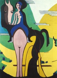


 RIDER  1931-32


Esta época de Davos, ya entrando en la última etapa de su vida, es uno de los momentos que anteriormente mencionaba como de gran interés.

 Kirchner, conocedor del movimiento de La Bauhaus, de la obra de Le Corbusier, y de los movimientos contemporáneos, va a ir adquiriendo una factura más abstracta en su obra.


 DESNUDO EN NARANJA Y AMARILLO 1929 1930


Pero aunque retirado en Davos, sigue la actualidad y el movimiento nazi con preocupación. Al igual que muchos de sus compañeros expresionistas ve su obra retirada de los museos y él mismo es expulsado de la Academia de las Artes. La anexión de Austria a Alemania no hace más que aumentar esa inquietud. La sospecha de que Suiza puede ser invadida le lleva a suicidarse en 1938, no sin antes destruir una buena parte de su obra. Fue enterrado en Davos en dónde también se encuentra un museo dedicado a su obra. http://www.kirchnermuseum.ch/sites/en/e_l_kirchner.html


La obra de Ernst Ludwig no ha sido demasiado conocida salvo para los que hemos estudiado los diversos movimientos artísticos. Es por ello que esta exposición de Fundación MAPFRE es de gran valor, por su sencillez a la hora de exponer la obra y sobre todo por ser una de las retrospectivas más completas que se han visto en este país.


NOTAS: Para mejor visualizar la fotografía “picar” con el ratón encima de las que interesen.
Para la lectura de entradas anteriores, ir a la ventana de la derecha y “picar” en los años y meses. Se desplegarán los títulos correspondientes a cada fecha.
Para la elección de otro IDIOMA ir con el cursor al final de la página.


Fuentes consultadas:
Expresionismo. Dietmar Elger Edit.Taschen
Historia visual del Arte. Claude Frontisi. Edit. Larousse.
Historia del Arte del Siglo XX. Varios autores. Edit. Taschen.
Catálogo para la Retrospectiva de Ernst Ludwig Kirchner. Fundación MAPFRE.