Subjects and Portraits: Ottoline Morrell


Not long ago I wrote a post speculating what French empress Josephine might have looked like, based on evidence from paintings and sculptures. Josephine lived before photography, so we have no evidence from that source.

Let's look at the matter of painted likenesses from another perspective. In an occasional series of posts, I'll present both photos and paintings (along with drawings where paintings are scarce) and we can have fun comparing them. I won't be giving out points for accuracy, however. That's because post-Daguerre artists have more freedom to interpret their subjects than might have been the case in the days where portraits were intended as documentation.

My first subject is Lady Ottoline Morrell, a colorful character, as this Wikipedia link indicates. There are a fair number of photos of Ottoline, but virtually no portraits by artists. A Google search turned up only three -- two of which (by Lamb and John) were done by artists who also were among her lovers.


This photo was taken about 1900 when she was in her late 20s.

This circa-1911 photo shows her with her daughter Julian.

By Simon Bussy, c.1920.

Drawing by Henry Lamb, c.1912.

By Augustus John, 1919.


The pictorial evidence suggests that Ottoline was hardly a "flash" female. But she had gobs of aristocratic family connections and might well have had a compelling personality; the link above mentions Bertrand Russell as one of those lovers, so she clearly was able to distract him from philosophy and mathematics.

Lamb's drawing was made when she was nearly 40 and strikes me as being being affectionate and perhaps a bit flattering. The paintings depict her in her late 40s and seem not at all flattering. Perhaps some day I'll get around to reading a biography of John where I might find out whether the portrait was painted before, during or after his fling with Ottoline.

Banderas del bicentenario en el V Encuentro de las Artes


CeleBraNdO el BiCeNteNariO

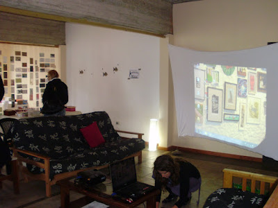
Luego de haber recorrido varios puntos de la Argentina, la exposición colectiva CeleBraNdO el BiCeNteNariO llegó a Mar de las Pampas en el marco del V Encuentro de las Artes que se llevó a cabo el pasado 28 de agosto de 15 a 18 hs. en Copacabana esquina 29, Las Gaviotas.

La muestra consistió en más de 200 banderas argentinas intervenidas por más de 200 artistas de las diferentes provincias del país que fueron convocados con motivo de la celebración de los 200 años de la Revolución de Mayo.

La docente y artista visual Silvia Calvo realizó esta convocatoria con el objetivo de rescatar el espíritu de los hombres de mayo y su deseo profundo de libertad. La idea le surgió luego del Congreso de Arte Correo realizado en diciembre del 2009 donde comenzó a invitar a los artistas a participar enviando en algunos casos por correo postal sus banderas para ser intervenidas.

En las banderas algunos hicieron collages, otros las pintaron, les pusieron alfileres de gancho y hasta hubo quienes las cortaron en pedazos. Pero todos respetaron la consigna: apropiarse e intervenir la bandera argentina, haciéndola su obra de arte.

El blog es:
http://celebrandoelbicentenario2010.blogspot.com/

Las fotos de las exposiciones hechas:
http://banderasdelbicentenarioalviento.blogspot.com/


Para ver la nota y entrevista en la TV Pública:
www.youtube.com/watch?v=XL6dKgdK75Y


Armando la muestra en Pueblo (Las Gaviotas)


Baseball Cap Etiquette and Fashion Notes


I wore baseball caps when I was a kid. In those days, all you could buy were sized -- none of this Velcro strap at the back business. By the time I became a teenager, I stopped wearing hats of any kind except when it got really cold outside. In the Army, we had to wear hats or helmets when outdoors, the hat style depending on the uniform of the day and perhaps the wishes of the post or unit commander. On returning to civilian life, I again stopped wearing hats until around six years ago when I finally bought another baseball cap. With a Velcro strap.

(Actually, that's not quite true. After moving to Albany, New York I did buy a Navy watch cap for cold weather use. And once when I had a consulting project that involved a trip to Death Valley, California I bought a brimmed hat for sun protection.)

Back to baseball caps. After a while, the things became somewhat addictive. I'd buy them as souveniers or sometimes as personal statements. But for some reason I don't like to wear a cap that I don't relate to in any meaningful way. For example, I never attended Yale University, though I've visited Yale several times over the years. But to me, visiting is not sufficient association for buying a Yale cap. On the other hand, I bought a cap commemorating the Royal 22ieme Régiment Canadien Français because I witnessed their flag-changing ceremony at Québec's Citadel (a ceremony performed once every few years). Clearly, I'm not rock-solidly consistent with respect to degree of association and caps.

Once nice thing about baseball caps is that they are pretty inexpensive souvenirs (current prices range around $10-$30, though couturier caps can set you back more than $200). Moreover they are useful, unlike other souvenirs that collect in corners of dresser drawers. My problem is that I now have lots and lots of caps, even after having weeded some out from time to time; how do I select a cap from my over-sized collection when I'm on my way out the door?

One selection criterion is the weather. I recently bought an Eddie Bauer cap that's been wax-treated, making it somewhat waterproof. So I'll probably be wearing it when it's raining. Another factor is what I'm wearing. I usually select a cap whose main color suits -- or at least doesn't clash with -- the rest of my wardrobe. That's one reason for having so many caps: I wanted a decent color selection to choose from.

Finally, there's the matter of the symbol on the cap; most baseball caps nowadays symbolize something or other. I do have a couple of caps bearing no logotype or slogan, so I can always wear one of these if I want to be truly neutral. Otherwise, it depends on my mood.

Since I live in Seattle, I occasionally feel like grossing out the locals by wearing a camo-pattern cap with the word ARMY on it. And if I'm near the University of Washington I sometimes get all snooty and wear one of my Penn caps. Other times I show solidarity: In Dukes's restaurant in Honolulu I might wear my yellow Duke's cap. Sometimes there are instances where I don't want to be misidentified. For example, I have a couple of caps with symbols relating to British Colombia and they also spot tiny Canadian flags on one side. Since I don't feel a need to apologize for being an American, I don't wear the Canadian caps overseas and run the risk of having people thinking I'm ashamed of my heritage and resorting to camouflage.

Clearly baseball cap wearing is a complicated subject. I'm interested to find out how cap-wearing readers cope.

Norman Rockwell and Glamour


Several years ago on the 2Blowhards blog I wrote about illustrators and the subject of glamourous women. At one point I opined that famed illustrator Norman Rockwell couldn't really do glamour. One commenter wrote that I was wrong about that.

Recently I came to the conclusion that I was indeed wrong -- this after stumbling across some Rockwell illustrations that incorporated fine looking females.

Rockwell was, from a technical standpoint, a hugely talented artist. He could produce images of reality that were true to life and contained many nice painterly touches that are best appreciated viewing the original paintings rather than printed reproductions.

He also had limitations, and was aware of some or most of them. For one thing, he admitted to being uncomfortable about deviating from what he was able to observe. And, as someone noted (I forget who), the lighting of his subjects tended to be from the direction of the viewer. In other words, usually flat -- no chiaroscuro effects. He also tended to avoid indistinct edges, shadows that merged subjects into backgrounds and strong focal points. Focal points were more compositional than attained by painterly effects; his paintings were relatively uniform across the surface in terms of edging and detail treatment.

What I'm beginning to see as I come across more of Rockwell's work is that the characteristics just noted are found mostly in his covers for the Saturday Evening Post magazine, the vehicle for his fame. His story illustrations for other magazines and some of his advertising illustrations deviated in varying degree from the Post formulas he followed. It is here where one can find a less-familiar Rockwell.

Let's look:


No, this isn't by Rockwell. The artist is Jon Whitcomb who was 12 years younger and one of the most famous "glamour girl" illustrators of his time (in-depth information on Whitcomb can be found here). I include this as a yardstick for evaluating the glamour quotient of the Rockwell illustrations that follow.

This is from the Ladies' Home Journal issue of July, 1929. Click to get an enlarged view and note Rockwell's treatment of the woman.

Here is another story illustration, this from the April, 1935 issue of American Magazine. The woman is attractive and the painting style noticeably different from his Saturday Evening Post practice.

Now for some Post covers. This was painted for the 21 October 1933 issue.

And here's Rockwell's cover painting for 26 July 1941.

Rockwell goes Hollywood for the 7 September 1937 issue. In each of these illustrations, he goes beyond the "conventionally pretty girl next door" depiction most people associate with his work. The illustration below is conventional Rockwell.

For Saturday Evening Post, 19 November 1938.

Finally, Rockwell really goes Hollywood in this 1965 illustration of Ann-Margaret as she appears in the remake of the movie Stagecoach.


As you (and now I) can see, Norman Rockwell could indeed do "glam" when he put his mind and paintbrushes to it. Even though it wasn't often.

Buffalo Before the Bust


A while ago I posted here about Detroit skyscrapers built in the Art Deco era before the automobile industry and, as a consequence, city growth hit the proverbial wall when the Great Depression struck.

Another hard-luck city is Buffalo, New York. Buffalo was home to Pierce-Arrow, a builder of low-production luxury cars, as well as auto industry-related factories. But Buffalo, an important city in 1930, wasn't so strongly tied to one industry. Its main reason for being was that it was located at a major transportation-break point. (That's geographer-speak for a place where goods are transferred from one mode of transport to another.) Such transfers require infrastructure, personnel and a number of support organizations -- in other words, a town will develop there and grow into a city should the volume of transferring cargo become large.

In Buffalo's case, the eastern point of unfettered Great Lakes inter-lake navigation is in the general area of Buffalo. After Buffalo, Great Lakes water plunges over Niagara Falls. (This claim no longer holds thanks to construction, starting in the 1820s, of the Welland Canal through Canadian soil. The canal originally was sketchy and went through two upgrades before the present canal was opened in 1932. Ships can steam from Lake Erie to Lake Ontario via the canal and its system of locks. But before the canal, Buffalo was as far as ships could shuffle off to.)

So Buffalo developed a harbor for Great Lakes ships. On the land side of the equation, the Erie Canal (later the New York State Barge Canal) was opened in 1825 followed by railroads a few decades later. Great Lakes cargo would move from ship to barge or rail car -- or vice-versa -- and Buffalo thrived. Over time, other industries developed; for instance, besides automobiles, by the 1930s Buffalo was an important builder of aircraft (Consolidated, Curtiss and Bell were based there at various times).

What finally brought Buffalo to its economic knees was the opening of the Saint Lawrence Seaway in 1959 that, at a stroke, drastically reduced transportation-break volumes. Subsequent attempts to turn the regional economy around didn't meet with much success and the city drifted from being a headquarters to a branch-plant town.

So much for background. Below are four important Deco-era structures of architectural interest that you can witness if you find yourself within striking distance of central Buffalo.


Postcard of Rand Building - 1929
The Rand Building is the least of the lot from a design standpoint. But it's tall and contributes to the city's character.

New York Central Terminal Complex - 1929
In the late 1920s the New York Central Railroad decided to rationalize its Buffalo facilities and created a major terminal not far to the east of downtown; other railroads also used it. The problem was that it was too large. I suppose the folks at New York Central extrapolated rail traffic and urban growth trends to support the case for such a large station. However, setting aside the Depression, rail passenger traffic had begun to peak as potential passengers shifted to cars, intercity buses and, later, aircraft to get around. After World War 2, traffic fell off alarmingly and the terminal complex became increasingly irrelevant.

Terminal Complex, aerial view

Liberty Building - 1925 - as viewed from the Rand Building
Those short towers (do they really qualify as towers?) are the most distinctive architectural features. Atop each is a small version of the Statue of Liberty. The scene in the picture is of interest because the relationship of downtown Buffalo to Lake Erie can be seen. Also, note the large structure between the Liberty Building and the lake: it is ...

Buffalo City Hall - 1931
I find Buffalo City Hall to be a truly impressive example of Deco-era skyscraper architecture; it generated a real "wow" reaction when I drove by it last year.

City Hall tower detail
The whole building is interesting, but the hard-to-see-from-the-ground top is a nice touch indeed.


Observe! You Budding Artists


At the art school at the University of Washington I was exposed to a number of training practices that, in retrospect, weren't very useful. Check that: even at the time I had my doubts, but was too naïve and trusting to fully realize that I was being shortchanged.

I'll provide more details in future posts, but for now will deal with the matter of viewing subjects. When presented with a still life setup or human model or whatever, an instructor would often tell us to "observe" or "see."

Just what we were supposed to observe was seldom made clear. They did teach us to hold a paintbrush handle between us and the subject, arm stiff, to measure or compare dimensions of what we were painting. And that's about all the "observing" I could manage given my state of ignorance.

The problem that cropped up again and again in many of my art school classes was that the faculty was collectively afraid to actually teach us much of anything in fear of destroying our precious creativity. Or maybe it was art school policy. I don't know for sure, but those were the vibrations I absorbed; lord knows we got little actual instruction.

Many years later, I'm beginning to understand what they were talking about -- at least in the case of drawing or painting a human likeness. Provided an artist knows the shapes and proportions for the expected or average case, then, when he studies a subject, he can compare what he sees with the norm. That is, he might notice that the distance from the bottom of the nose to the chin tends large or small and the eyes are narrower or wider-set than expected.

Clearly such observations can be made by fledgling, under-trained art students such as I was. But the process of observing becomes faster and more sure when looking for variations about a norm rather than trying to figure things out from scratch.

Another example might be rules-of-thumb dealing with light and shade. These hold that, in most cases, warm light results in a cool (blue tinted) shadow and cool light produces warm (i.e., with touches of brown, purple, etc.) shadows. I was never taught these rules. If I had, then I might have been better able to "observe" my subject and decide whether or not the rules held in that instance. Put another way, why were we supposed to discover such things on our own? I didn't "discover" this information until I read in in books -- and might never have.

What, then, was the point of having an art faculty to "teach" us if they would not teach?

Fotos de la Muestra LIBROS DE ARTISTA COLECTIVO


"Formas de encuentro en las artes visuales"
charla a cargo de Alejandra Bocquel y Fabián Zanardini


"Acerca de la categoría objeto en las artes visuales"
charla a cargo de Norberto José Martinez